Please help with the "Wall of Harm"

1) For each entry, have a set of links at the bottom to the categories that include that entry. This would more clearly show what woo is involved in each case.

Yes, I definitely want to do that. It may or may not be there at "launch" but I'll get it in there soon.

The other ideas are interesting too. On the graphs, I think I'll wait until the database is quite alot bigger before going that route. Right now I know there's alot of stuff missing in there, so I'm not sure deep data analysis would reveal too much.

Not sure about highlighting the wikipedia links. There's only 29 of them (out of 414 total links -- having this in a database is handy), so I don't think its worth the extra effort.

I do have a few links that are to nominally "woo" sites, I would like to de-emphasise those at some point, or at least mark them as NOFOLLOW once I have a decent search engine presence myself.

--Tim Farley
 
Brilliant, Krelnik!

Let me know if there's a bit of random research I can help you with. Although I don't have much time at the moment, being UK based and a French speaker I may come in useful.

Despite your source of inspiration, I'm glad you changed the name as the first image that popped in to my head was the Berlin wall, which probably wasn't too appropriate!
 
Redesign and permanent URL

As promised, I have moved the site to a more permanent and easier-to-remember URL. Please take another look here:

http://whatstheharm.net

Please give it a look and let me know if I broke anything in the move.

Thank you to kosai for the banner and new icons.

I've also rewritten the explanatory text to make it more appealing to non-skeptics. Gone are words like "woo", "skeptic" and "bogus". Now the text focuses on bad information and the power of critical thinking. Please let me know if you see anything I missed.

I changed the "critics" page to a FAQ and added a resources page to link to good material on critical thinking.

Still more changes to come, so if you made a suggestion that I haven't acted on yet, be patient.
 
Hmm, I see the banner + side menu + stats summary on all the pages I clicked on.

I'm using IE7, if that's any help.
 
Ummmm.... I am seeing no banner. On any page.

Wow, that's odd. I'm not doing anything fancy, just:

Code:
<img src="graphics/banner.jpg" width="773" height="151" alt="what's the harm?" border="0">

By any chance are you running an ad-blocker? I'm wondering if the filename "banner.jpg" is triggering it?
 
Hmm, I see the banner + side menu + stats summary on all the pages I clicked on.

I'm using IE7, if that's any help.
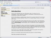
I have tried it with IE7 v7.0.5730.11 and with Firefox 2.0.0.11, and neither shows a banner. I see the menu on the left-hand side, I see the "2,427 people killed, 17,708 injured and over $89,328,989 in economic damages" accross the top, but no banner.

I am using Windows XP Home Edition, version 2002 SP2.

Here is what I see on the opening page:
 

Attachments

  • whatstheharm.jpg
    whatstheharm.jpg
    31.7 KB · Views: 4
Interesting! I just disabled Norton Personal Firewall, and the banner appears.

ETA: Now I've reenabled NPF, and the banner still appears.
 
Last edited:
I just changed the filename, I think that must have been it.

ETA: Yes, Google seems to indicate that Norton Personal Firewall has an ad-blocking feature, that must have been it.
 
Last edited:
Ah. Good! Curious: what was the file name before?

By the way, note my new sig line.

And add one to yours!

Congrats on your grand opening!
 
Glad that's all sorted :)

So, can we start linking to the web site now, or will you make a general announcement?

And should we bring virtual champagne to smash against the question mark icon?!
 
On List of Topics page:

Typo: Superstitous ritual s/b Superstitious ritual.

Suggestion: when a topic name wraps to more than one line, indent the lines after the first.

Using Yellow text on a white background (for highlighting when moused-over) may not be so great an idea.
 
The new site looks great!

A thought I just had, though - it may or may not be a good idea - there are, for many topics, links to skepticism sites as the only general description of the category. While the information on such sites is probably of very high quality (a good skeptic checks their facts carefully), it could be seen as unbalanced. Adding links to websites that promote the woo in question would show the other side of the coin, and give more complete information on the topic, but risks generating new believers from credulous readers.

I notice that, in a number of cases, you have links to the same Wikipedia article next to each of several victims of the same woo. In general, unless the Wikipedia article is about the specific case, I'd personally lean towards putting the link to the article about the woo up at the top, as it would give a neutral and informative description of the woo in question. Of course, linking to points within the article for individual cases does work if that's the only source you can find (though one would expect that the Wikipedia article should have sources of its own, which might provide more information than the individual blurbs in the article).

You might want to try and come up with a different name for the "Religion" category - it gives the impression that you're attacking mainstream religion, which will alienate many readers. Perhaps "Religious Fundamentalism", "Religious Extremism", or similar. Most of the cases seem to be from fringe groups, with the balance coming primarily from fundamentalist sects. I'm also not sure whether some of the stories even belong under "Religion", since some are from the "Cults" section, it seems kinda redundant to put them under "Religion" as well.

One case, Kyle Lake, seems to have been killed by a stupid mistake (electricity + water). While he was performing a religious ceremony at the time, this was not an intended part of it, and as such is no more the fault of the religion than being killed by tripping and hitting your head on a pew. Rather than being a warning against uncritical thinking, I'd call it a warning against lack of care with electrical equipment.

Please don't take my comments the wrong way. I think that the site is wonderful, and it has the potential to help a lot of people. It's just still young, and inevitably people will disagree on exactly how stuff should be arranged, as everything gets gradually sorted out and polished up.

And please, let us know when to start promoting the site. One thing that might help would be to include a bank of common search strings related to the site's purpose (especially the topics - if someone's not sure about homeopathy, for example, and googles it, you want them to see your site), though I'd hold off on that until you're ready to start promoting the site.

ETA: I thought I should clarify that when I talk about the "Religion" section above, I mean the subcategory that's linked to, not the overall heading that contains the links for cults, Scientology, etc.
 
Last edited:
So, can we start linking to the web site now, or will you make a general announcement?

Sure thing, link away! I'll sit here and cross my fingers that I bought an appropriate bandwidth package.

And should we bring virtual champagne to smash against the question mark icon?!

I plan to celebrate the launch at the TAM 5.5 Forum Party this coming Saturday.

--Tim Farley
 
One idea is to go to all the woo and neutral forums and put it there and see how you go. No doubt you will be banned from some of them quickly, but at least you will have exposed a few woo people to it.

It is no good just showing us it or leaving it for woos to find. They will not look at it without it being put in their face.
 
Overall: Very nice. Very nice because it's very simple.

A few points, though:

You must - must, must, must - underscore all links in the text. I am thinking specifically of the "List of Topics". You underscore links in the FAQ and Resources pages. The double-line spacing in the Resources page is how "List of Topics" should look like.

Be consistent - the hardest part of designing! ;)

The left side menu should also have double-line spacing.

You should consider using indents instead of lines in the left side menu, to more clearly indicate sub items.

When you link to outside sources, you should clearly indicate when the user leaves the site. It is clear when people click the "?" icon, but in other places, use a small icon or indicate by text. Users hate to lose track of where they are - it's the number one gripe.

When you click on the top logo, it doesn't lead to the top page. This has become the de-facto standard.

When you list the "?" icons for each case, you could consider inserting a <br> just before, so that they line up to the left always. That way, the user doesn't have to scan the line to find it.

You have to warn people in advance before they click on the "Everyone" link. Right now, it's shy of 2,500, which is bad enough, but what's going to happen when you hit the 10,000 mark (which, given the widespread wooisms out there, you will real soon!)?

If you are going to have that much info on one page, why not make it available for people as a Zip file?

Likewise, it would be a very good idea on the "List of topics" page to indicate how many cases people can expect. E.g. "Acupuncture (18,324)"

Again: Very nice.
 
Hi Krelnik

Just wanted you to know FYI - I am on a Mac, using 'Safari' as my browser and I can see everything perfectly! (Sometimes things do display slightly differently on Safari - but your page is perfect!)

From a creative standpoint I DO very much like it when the entries have pictures - it breaks up the text and makes the point very eloquently that this is REAL people being discussed. Do you have to get permissions to use the pictures, or can you simply use them if they have been in greneral editorial use?

All best
DeVega
 
Thanks for all the tips! With TAM 5.5 coming up and work being very busy this week, I don't have time to address them all right away, but they are all noted.

DeVega, I'm basically cheating on the photos, on the assumption that they are only thumbnails. In almost all cases, I link to the site where the original is found. (Yes, I am aware that even mighty Google has gotten their hand slapped in court over thumbnails). I'll add a feedback link soon, and make it clear somewhere that if someone from a family objects to my use of a photo, I'll remove it.

--Tim Farley
 
WOW!

I love, love, love your site krelnik!

I hate it when believers throw the "what's the harm" into their arguments. It makes me seethe. This is now the perfect thing to show people exactly why I am a skeptic and what we are all fighting against.

Thank-you.
 
Last edited:

ISF - Join now!

Every member here is approved by hand. No bots, no spam, just people who care about evidence and honest debate.

Membership is free!

Create your free account

Back
Top Bottom