Yesterday I posted a before and after image showing how the 'Zeke' filter in Windows 10 acts as a contrast tool, that it merely accentuates micro-particulate matter that is faintly visible pre-Zeke, that it does not create any obvious new artefacts. AsI say, a contrast tool, and a handy one too for Shroud studies, being well-adapted to the range of hues on the Shroud body image.
So why the raucous laughter, or the internet forum equivalent thereof? Why the assumption that I am an innocent abroad in matters to do photoediting, notable the mode of action of contrast controls? How many people here have been following my postings these last 5 years and more, currently in excess of 400?
As indicated earlier, I had a brief conversation in August 2015 with Mario Latendresse PhD, creator of the Shroud Scope tool. Here's the relevant part of that posting in full:
Posting: Aug 28, 2015
Update: 1 month on (30 September 2015):
Why does the allegedly straw-coloured TS image look so mauve and low-contrast in Shroud Scope, with scarcely any difference between body image and blood? I have emailed Mario Latendresse, and put it to him that the “Durante 2002” image supplied to him may have been photoedited to decrease contrast – with tell-tale reduction in the percentage of red/green (corresponding to yellow in additive, non-pigment colour mixing) combined with an increase in the percentage of blue. This hard-to-fathom shift in colour balance is readily modelled when one takes, say, other TS images, notably those labelled as “Durante” and/or “post 2002 conservation” and intentionally decreases contrast to obtain that somewhat unsatisfactory default “Shroud Scope” look that cries out for extra contrast. * (See below for a copy of my latest email to Mario, October 4th 2015, setting out my case in detail for giving his Shroud Scope post 2002 conservation Durante-derived image some additional contrast).
Update: October 4th. Here’s a copy of an email sent earlier today to Mario Latendresse (see above):
Hello again Mario. Sorry to be so long in getting back. I’ve been busy looking at precisely what happens when one takes a typical ‘sepia-toned’ photograph of the TS, or rather its central zone, avoiding those 1532 burned regions, reducing contrast in my MS Office Picture Manager by degrees until it looks more like your Shroud Scope, and recording the RGB total and composition at each stage, using Image J (provided in the 3D Plugins/Analyze menu). Pure white is of course a max of 255,255,255 and pure black 0,0,0, giving max values of 765 and 0 respectively if one were working in grayscale (which of course we’re not, choosing to stay with colours, artefacts an’all, with a view to identifying precisely how the artefacts arise.
See attached my diagram in paint for the two simultaneous changes that take place when one lowers the contrast (though I doubt that any of this will be new to you, while for me it’s been an interesting pattern-finding exercise).
Caption
Highly schematic representation of what decreasing contrast does in terms of total RGB value (max 255,255,255) and % composition. Reducing contrast reduces total (R+G+B) and produces a strictly unit-for-unit shift from (R+G) to blue, which is equivalent to yellow to blue in additive colour mixing.
(Note: the above colours are not pure RGB 255 values, needless to say, being straight from the MS Paint palette).
First, the total (R+G+B) reduces when one moved the Contrast control from the mid-range zero down through negative values towards -100. Distinct blueing of any white areas in the image becomes apparent when one goes past -30 (I deliberately introduced a small solid white circle to my TS image in order to monitor that effect, though not enough to affect the average RGB except marginally).
The reduction in total RGB was related to the contrast setting by applying the formula:
% reduction = contrast setting x 0.3 (accurate to within 1% or less).
So on a Contrast setting of -40, there was a 12% reduction in total (R+G+B). On – 60 it was 18% etc.
As for the shift in colour balance, that too proved easy to quantify, simply by eye-balling the numbers and spotting the pattern. With progressive decrease in contrast, the sum of (R +G) as a percentage of total (R+G+B) became smaller, while B became larger. In fact, the two were simply related. If the initial (R+G) as a percentage of (R+G+B) was, say x%, and reduced to y% of the new (R+G+B) total, i.e. an absolute change of (x-y) percentage points, then the B component increased by (x-y)% when comparing its final % contribution to the total with the initial in absolute terms.
No doubt there are sound theoretical reasons for these patterns that you will understand, and possibly provide a link, but as I say, I’ve been content to see it simply as a hands-on pattern-finding exercise.
Conclusion: at least when using my photoediting software to decrease contrast, its impossible to avoid (a) a reduction in total (R+G+B) and (b) a shift away from (R+G), i.e. yellow towards blue.
That does not seem unreasonable, even if unavoidable. When increasing contrast in gray scale, the aim is to make the brighter regions brighter still, i.e. shift from gray to white, and the darker regions shift from gray towards black. So the opposite applies to a reduction in contrast – making the darker gray regions a lighter gray, making the paler gray regions a darker gray, thus reducing contrast. To achieve a similar effect with coloured images, yellow stands in for white (requiring a mix of R + G) while blue substitutes for black.
The test for the soundness of that conclusion from this novice is to predict what happens when one increases contrast in a TS image. One expects it to become progressively brighter, more yellow, less blue, and that is indeed what one sees.
Take home message: looking at your default Shroud Scope image alongside the more straw/sepia-toned Durante images available elsewhere online,
I strongly suspect that the image you were given was originally sepia-toned too, and that the supplier deliberately reduced the contrast. Would you agree or disagree with that conclusion Mario?
If you agree, would it not be better to increase the contrast as default, rather than supply that option for increasing or decreasing contrast. Granted there might be a problem in deciding what was the “correct” default value. Maybe there isn’t one, at least scientifically, given that arbitrary decisions need to be made when converting a faint 4m x 1m image to a compact one on a computer screen. However, I maintain that it’s reasonable to expect better differentiation between blood and body image than one sees on Shroud Scope, where most of the difference ones sees with the other images have been largely lost (a shame in my view, making for a less interesting image).
(
Update: helpful and constructive reply received to my email – 9th October – see below)
Email reply just in (still October 8th) from Mario L – see earlier re the contrast level in Shroud Scope(my italics):
Hi Colin,
You have seriously taken on this project.
The Durante photo can certainly be modified to enhance contrast on a computer screen.
My only little quibble is on your use of “deliberately reduced the contrast” as if some negative intention were implied, but I might be reading too much in that statement.
It was probably deliberate but for a specific reason, such as to increase visual acuity when printed, but I have no idea if this is the case.
A probable project would be to enhance the contrast of various areas of the photo with different parameters. Enhancing contrast over the whole photo is not ideal for viewing, because in doing so, the visual acuity is reduced in some areas.
By the way, I prefer to use raw tools such as “convert” from ImageMagick, because you can explicitly and systematically control the transformations. You can also automate the process used and document it so that others can easily reproduce it, even by using other software based on such transformations. I have never used ImageJ.
I will wait until I get the new implementation of Shroud Scope to reconsider what to do about the Durante photos. I might change its default contrast.
Best,
Mario
(end email)
I shall now take break from this site. The attempts to debase arguments via
reductio ad absurdum, to browbeat perceived opponents into submission is frankly tedious and time-wasting. As someone who's reached his 70s, I have better things to do with my remaining time than squander it here.


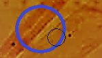
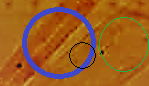

 , is that each pixel in the macro images corresponds to dimensions several orders of magnitude larger, i.e. millimeter(s) than the particles he concluded were there. He defintely sees something new when he uses the filter, all I'm saying is even it's real he has no evidence to identify it as "particles". If he's seeing something real it could just as well be the result of staining or dyeing.