Israeli soldiers admit to murder, useless vandalism, in Gaza

What do you mean by refuting the maps? Can you even tells us what the maps you have put here refer to. And by that I mean the exact details.

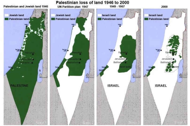
I linked to that series of maps to illustrate the trend of increasing israeli control and decreasing palestinian control of israel over time.

The UN has many times told both sides that they should respect the current borders, go home and enjoy life.

The israelis have consistently kept on pushing the palestinians into smaller and smaller geographic ares.

There was discussion earlier in the thread that the IDF's current actions do not necessarily point to an over-arching israeli plan to take the lot. I agree that one does not necessarily follow from the other, but those maps clearly show that they are well on the way to doing so, officially stated policy or no.

By 'no attempts at refuting the maps' I refer to the trolls in this thread attempting to make the discussion about the credibility of the source of the maps, not the ramifications of the trend shown by them.
 
Last edited:
Will you throw a party when it's all white, no green? Will there be fireworks and cakes and a band?

I have a feeling you would give a party if it was all green, no white.
 
Malkuth, do you think that Israel has a right to exist as a state?
Do you advocate it's desturction so the land can be "returned" to the Palesinians?
And if so, what do we do with the Five Million Jews now in Israel?
 

Once again we encounter the "this link may support me, I'll post it without reading it" syndrome.

I grabbed the first few sites listed, from your link, as hosting that image.

Would you like to guess what kinds of sites they were?

www.ifamericansonlyknew.org
www.doublestandards.org
bbs.chinadaily.com.cn
lawrenceofcyberia.blogs.com
razia-razia.blogspot.com
 
You can make an argument that founding a Jewish State in the Mid East was not a great idea (I am not saying I agree with that, just that you can make a good argument for it) but the fact is Israel is there, it has five million Jewish citizens in addition to other citizens, and they are not going anywhere else. Which sort of makes arguments about what happened in 1948 pretty academic.
 
Point is, you now have to discredit hundreds of sites. Start with #22, rationalwiki.com

Or stop your laughable tactics and behave in an adult manner discussing with Malkuth.
 
By 'no attempts at refuting the maps' I refer to the trolls in this thread attempting to make the discussion about the credibility of the source of the maps, not the ramifications of the trend shown by them.
Besides the credibility of the source where you got this map, there is the matter of the credibility of the map itself. It's just a map with colors on it. It it up to you to show that the map is correct, not for us to do your research for you.
 
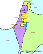
See, here's another map with no sources or information as to how it was drawn. Refute it!
 

Attachments

  • palestine_map.jpg
    palestine_map.jpg
    16.2 KB · Views: 4
Point is, you now have to discredit hundreds of sites. Start with #22, rationalwiki.com.

Is that the only non CT-Whackjob site you could find? One that admits it's a biased article?

rational wiki said:
There is a broader, perhaps slightly less biased, article on Wikipedia about Israel

The fact that you had to go to the second page of results to find a non CT-Whackjob site that doesn't even stand behind the article says something.
 
I linked to that series of maps to illustrate the trend of increasing israeli control and decreasing palestinian control of israel over time.

So you can not tell me what the colors in each of the maps in your series actually represent. You linked to this map. I think I am allowed to expect you to show some knowledge regarding it.
 
@#192: You got that wrong. I had only to go to page two to find a site that I was absolutely sure even you wouldn't label a "CT-Whackjob" site. Shows how broadly this image is spread. Now grow up.
 
@#192: You got that wrong. I had only to go to page two to find a site that I was absolutely sure even you wouldn't label a "CT-Whackjob" site.


There is something wrong with your perspective if you consider something decently sourced when you say that only the first 20+ results searching for it come from CT-Whackjob sites (and the one you choose as non-whackjob comes with a disclaimer).
 
Last edited:
Here you guys go again continuing to attack the sources without even trying to refute the information with facts.

@Mortimer, if you wish to refute it, it IS your responsibility to show research that supports your assertion.

What I find incredible is that some of you have wasted so many posts in this thread attacking me and and the source of a piece of information I posted. All you had to do was a little research, showing 'more credible references' showing maps that differ from the ones I have shown. You haven't done so, nor can you. All you have to offer here is ad hominems and obfuscation.

I tire of your collective trolling.

@Doctor Evil, it's quite clearly marked as the legend on the maps. Green is palestinian controlled land, white is Israeli controlled.
 
Last edited:
@Doctor Evil, it's quite clearly marked as the legend on the maps. Green is palestinian controlled land, white is Israeli controlled.

No, it is clearly not. This should be clear to anyone with a little bit of relevant historical knowledge. Which goes to show that you do not know the meaning of the map. Since it is not my source I can just try to deduce what is meant.

I will reproduce the map for your convenience:
3117349dbb5716fda1.jpg


Map 1 - 1946: I believe that the white areas denote land which owned by Jews. The rest is marked as Palestinian. This is comparing apples and oranges, as private land owned by Jews is not compared to private land owned by Arabs. Instead everything else is deemed Palestinian, which is weird, since the sovereign power at the time was the British Mandate.

Please do not take this as if I am implying that there were no Palestinians, or that they had no rights on the land. I do not argue that. All I am arguing is that this map has been labeled in an intentionally misleading way.

Map - 2 1947: This is a map of the UN partition plan, which was a suggested political settlement to divide the mandate. The Jewish leadership accepted the plan, while the Arab leadership categorically rejected it, opting for war instead.

Since the plan was not agreed upon the sides, it was never realized, and thus there was never a moment in time where the map would actually correspond to reality. In this map the colors are supposed to represent sovereignty.

Map 3 - : After the ensuing wars, this maps represents the cease fire lines between Israel and its neighbors. White represents the state of Israel. However, the green areas where occupied by Egypt and Jordan, and where not part of a sovereign state called Palestine.

Map 4 - : I do not know what this is supposed to represent. Presumably the areas which are defined as "Area A" under the accords between Israel and the Palestinian authority. In this is correct, then the rest is now supposed Israeli? Israels sovereignty was only extended to a part of east Jerusalem. So here I am not sure what the while area is supposed to mean.

We have just seen that the colors in the different maps do not represent the same geographical objects, even though they are marked as Jewish or Israeli land and Palestinian land in all maps. It gets worse.

There are stages on the map, presumably hinting for some plan. However, the author have played with history also in this aspect. As I have already explained, the 1947 partition plan was never signed, and therefore was never a reality. Including it as a stage is misleading. Furthermore, there were other changes. In the period between 1967 and the signing of the Oslo agreements Israel had complete control of the West Bank and Gaza. So, I wonder why there is no map where the whole territory is marked as Israeli land?

My interpretation is that this would go against the purpose of the author of this map, which is to argue that the direction is always the same. The transfer of areas to the full control of the Palestinian Authority, and the evacuation of Gaza settlements to not fit this, so they should be ignored. They do not fit to the intended message.

Please do not read my post as an overall discussion of the Israeli-Palestinian conflict. I am limiting my criticism to this map, which was presented to us as if it is self explanatory. This is not my understanding of this map. It was not constructed to clarify the history of the conflict but rather to obfuscate it. It was meant to take one of the most complex conflicts on this planet and to simplify it for political purposes.

Presenting this map, without explanation, and presuming that it tells the whole story of this conflict is wrong. No single piece of information can do that. Unfortunately, this type of argument is too common in this subforum. I would like to hope that this would change one day.

 
The green and white maps are pretty good for propaganda purposes but they're rather useless when it comes to useful information.

Here are the same maps, but with explanations as to what they're about...and they come from a non-whackjob CT site.
 

ISF - Join now!

Every member here is approved by hand. No bots, no spam, just people who care about evidence and honest debate.

Membership is free!

Create your free account

Back
Top Bottom