Michael Mozina
Banned
- Joined
- Feb 10, 2009
- Messages
- 9,361
That makes everything very clear for any newbies that happen to read it. But I'm not sure the message they'll get is quite the one you intended to communicate, Michael.
You're probably right about that. It's not exactly a newbie friendly topic, and math bunnies is a lingo related to other parts of the conversation.
")
Let's try GM's lingo then.
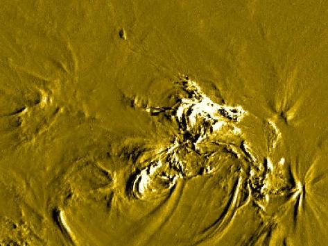
GM believes that the RD images are a "pie charge of temperatures" that relate directly to an "opaque photosphere, which relates to the inside surface of that red/orange chromosphere.
IMO it is a "pie chart of temperatures" that relate to a solid surface, that is 4800Km inside the chromosphere. When we run a RD image, we should see that the diameter of the round part of the pie, comes up 4800Km short of the chromosphere all along every limb (9600km total difference in diameter).
The LMSAL gold imaging technique is as a "faster cadence" RD image, that looks to be "averaged" in some way as the various dots fill themselves in over time. That particular 'technique" produces very high resolution images of the "surface of the sun" that is located about 4800KM inside the chromosphere, underneath of a highly ionized atmosphere that is not "opaque", but relatively transparent to these specific wavelengths of light.
GM's pi * d (inside edges of the chromosphere) circumference will come out quite differently than my predicted pi * d (limb darkened areas in the original image), not because pi is different, but because d is different.
Is that any better?
Last edited: