You are using an out of date browser. It may not display this or other websites correctly.
You should upgrade or use an alternative browser.
You should upgrade or use an alternative browser.
Ed Should Australia change its flag?
- Thread starter arthwollipot
- Start date
-
- Tags
- australia issues


Brian-M
Daydreamer
- Joined
- Jul 22, 2008
- Messages
- 8,044
In general, the more complex the shape the greater the cost of making the flag.
It's not that complex, just two solid shapes with irregular outlines.
Compare it to the vastly more complex designs of the flags of countries such as Afghanistan, Sri Lanka or Fiji, just as a few randomly selected examples.
http://www.worldatlas.com/webimage/flags/countrys/mideast/afganist.htm
http://www.worldatlas.com/webimage/flags/countrys/asia/srilanka.htm
http://www.worldatlas.com/webimage/flags/countrys/pacific/fiji.htm
arthwollipot
Limerick Purist Pronouns: He/Him
I was actually taught in school (keep in mind this was thirty years ago) that our sporting colours were green and gold, but our national colours are blue and gold.
The Atheist
The Grammar Tyrant
- Joined
- Jul 3, 2006
- Messages
- 36,454
Another
That's pretty good.
devnull
Philosopher
I dont much care about colours, but if it doesnt contain the words "I blew out a plugga" it isnt Australian.
Damien Evans
Up The Irons
It'll be appropriate when we adopt John Williamson's "True Blue" as the new National Anthem
I'd rather Bruce Woodley's I Am Australian
Damien Evans
Up The Irons
I dont much care about colours, but if it doesnt contain the words "I blew out a plugga" it isnt Australian.
I've literally never heard that term in my life.
I've literally never heard that term in my life.
I think Devnull is from WA.

devnull
Philosopher
My bad, it was "busted a plugga".
Warning - this is the most Australian thing ever.
Warning - this is the most Australian thing ever.
Damien Evans
Up The Irons
Tell me more about the NZ caramel system.
First, you coat John Key in a layer of sugar syrup...
Information Analyst
Penultimate Amazing
Do the original references to Scotland and Ireland not offend, then? And, of course, in 1879 all Australians were also as British as anyone else in the Empire.So we are going to pretend the Australian voters weren't conned into agreeing to a sycophantic paen to old England.
Last edited:
Brian-M
Daydreamer
- Joined
- Jul 22, 2008
- Messages
- 8,044
I was actually taught in school (keep in mind this was thirty years ago) that our sporting colours were green and gold, but our national colours are blue and gold.
Quickly checking Wikipedia, I see that the national colours officially became green and gold in 1984, and before that they were unofficially blue and gold. Although, green-and-gold used for sports long before they became our official colours.
Looks like even the exact shades of green and gold are explicitly specified.
Green: 348 C (pantone) or #008751 (hex)
Gold: 116 C (pantone) or #FCD116 (hex)
Guess I should adjust my proposed flag to match these exact colours:
Attachments

Last edited:
Ladewig
I lost an avatar bet.
- Joined
- Dec 4, 2001
- Messages
- 28,828
It's not that complex, just two solid shapes with irregular outlines.
Compare it to the vastly more complex designs of the flags of countries such as Afghanistan, Sri Lanka or Fiji, just as a few randomly selected examples.
http://www.worldatlas.com/webimage/flags/countrys/mideast/afganist.htm
http://www.worldatlas.com/webimage/flags/countrys/asia/srilanka.htm
http://www.worldatlas.com/webimage/flags/countrys/pacific/fiji.htm
Yes. Those are much more complex.
My point was merely that it is complex enough to add to the cost.
Lothian
should be banned
Quickly checking Wikipedia, I see that the national colours officially became green and gold in 1984, and before that they were unofficially blue and gold. Although, green-and-gold used for sports long before they became our official colours.
Looks like even the exact shades of green and gold are explicitly specified.
Green: 348 C (pantone) or #008751 (hex)
Gold: 116 C (pantone) or #FCD116 (hex)
Guess I should adjust my proposed flag to match these exact colours:

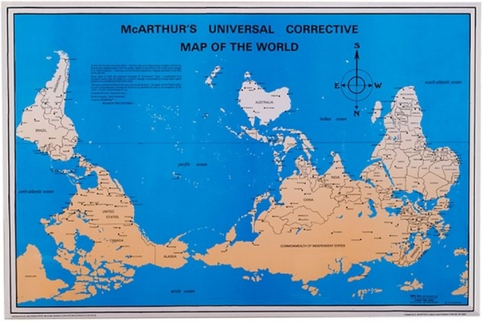
Is that how you see your country? Given Top and bottom of the world (North/South) are arbitrary don't you look at the world this way, with you rising to the top?
Last edited:
Brian-M
Daydreamer
- Joined
- Jul 22, 2008
- Messages
- 8,044
Yes. Those are much more complex.
My point was merely that it is complex enough to add to the cost.
Thinking it over, I'm wondering why it would add to the cost. It's not like they're making them by hand so that straight lines are more convenient to measure out.
In fact, it's probably less complex than the current flag, and only uses two colours instead of three. It might turn out to be even cheaper to manufacture than the current flag.
(Not that it would make much difference either way. I doubt that the specifics of the design would contribute significantly to the cost of production.)
Brian-M
Daydreamer
- Joined
- Jul 22, 2008
- Messages
- 8,044
Is that how you see your country? Given Top and bottom of the world (North/South) are arbitrary don't you look at the world this way, with you rising to the top?
Nah. When you put it south-side up, it ends up looking sort-of like the tattered remains of a love-heart that's had the bottom ripped off.