• You may find search is unavailable for a little while. Trying to fix a problem.
  • Please excuse the mess, we're moving the furniture and restructuring the forum categories

Where are humans on this simplified Hillis Plot?

Wowbagger

The Infinitely Prolonged
Joined
Feb 2, 2006
Messages
15,636
Location
Westchester County, NY (when not in space)
Hello, everyone!
I'd like to ask the help of anyone who knows evolution REALLY well.

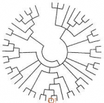
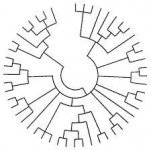
I am trying to identify where humans (or at least mammals) are on the simplified version of the Hillis Plot, attached to this post. After carefully tracing from a much more detailed version, I THINK I figured the branch out. But, I'd like to get confirmation from as many experts as possible. In the second image, I circled where I think the branch is, towards the bottom of it.

Unfortunately, I've never seen a properly labeled version of the simplified diagram to help me.

Thanks!
 

Attachments

  • 5609bfb754b4fc3b72ffcba93caaeccd.jpg
    5609bfb754b4fc3b72ffcba93caaeccd.jpg
    11.5 KB · Views: 221
  • AskForBranch.png
    AskForBranch.png
    31.3 KB · Views: 219
Hello, everyone!
I'd like to ask the help of anyone who knows evolution REALLY well.

I am trying to identify where humans (or at least mammals) are on the simplified version of the Hillis Plot, attached to this post. After carefully tracing from a much more detailed version, I THINK I figured the branch out. But, I'd like to get confirmation from as many experts as possible. In the second image, I circled where I think the branch is, towards the bottom of it.

Unfortunately, I've never seen a properly labeled version of the simplified diagram to help me.

Thanks!
Sorry, but if I am understanding your question correctly, without any labels humans could be almost anywhere (as with any extant species) on the extreme periphery of the plot. It depends on what lineage each line is meant to represent, and the time scale of the chart. For example, a recent branch point might represent that between humans and other apes, or between E. coli and Salmonella. Older branchings could represent the metazoan divergence, or gram positive vs negative bacterial divergence.
 
The diagram I provided appears to be a lower resolution version of the standard sort of Hillis Plots that are around, such as this one:

http://www.zo.utexas.edu/faculty/antisense/downloadfilestol.html

I suppose the layouts will vary, but there should be SOME semblance of a standard way to figure out what is where.

Many years ago, similar Hillis Plot temporary tattoos were given out at some Darwin Day events I went to. And, even though it wasn't labeled, someone claimed they were able to figure out where humans were, at the time.

(Sent from my Galaxy S5, using that lousy Tapatalk app thingy, or whatever it is.)

I suppose that the typically published Hill plot, if rooted in "primordial life" and emphasizing the human lineage (often giving just one example of species on many of the extant non-human branches [cows but not sheep for example]) can be used to identify the human branch. But the general pattern applies for every species if the labeling is done appropriately. Simplest example: humans are about as different from chimps as chimps are from gorillas: so most peripheral branch point on the lineage you indicated could represent that between chimps and gorillas, with humans omitted altogether.
 
Another point- the diagram ignores extinctions and horizontal transfer of genetic information, each of which played a very important role in evolution. Thus even the human lineage would have many more branch points near the periphery that never quite made it to the current day, and lines representing inbreeding between modern humans and extinct hominid species.
 
The one you've linked to has the big gap in the middle at the bottom and humans in the top left. The one you've posted has the big gap in the middle at the top, so I would estimate humans to be somewhere in the bottom right assuming rotation, or bottom left assuming mirroring. I can't make out exactly how one is supposed to map to the other well enough to tell if it's been mirrored or rotated, but either way it looks like you need to move your selection round by about 60 degrees in one direction or the other.
 
I thought about that. But, going by angle-of-gap alone could be deceptive. I was trying to trace major branches around.

But, I might get a better-labeled version soon...

(Sent from my Galaxy S5, using that lousy Tapatalk app thingy, or whatever it is.)
 
The diagram I provided appears to be a lower resolution version of the standard sort of Hillis Plots that are around, such as this one:

http://www.zo.utexas.edu/faculty/antisense/downloadfilestol.html

I suppose the layouts will vary, but there should be SOME semblance of a standard way to figure out what is where.

Many years ago, similar Hillis Plot temporary tattoos were given out at some Darwin Day events I went to. And, even though it wasn't labeled, someone claimed they were able to figure out where humans were, at the time.

(Sent from my Galaxy S5, using that lousy Tapatalk app thingy, or whatever it is.)

The answer is actually in the link. In the top left corner (about 10:30) there is a mark called "you are here". Barely visible in the link, but if you download it then it is easy to read.
 
It looks to me like you're approximately right.

The more simplified images (though not as simplified as yours) further down that page with labels help.

ETA: The above was meant to be addressed to the OP.
 
By the way, this is actually for an art project, not for anything more important than that.

I want it to be a scientifically accurate art project, though.

Tonight I will try to post a better-labeled simplified chart. I couldn't get to it last night.

(Sent from my Galaxy S5, using that lousy Tapatalk app thingy, or whatever it is.)
 
I suppose the layouts will vary, but there should be SOME semblance of a standard way to figure out what is where.

You mean there are rules as to what species have to be chosen for a Hills plot? If so, do you have a link? If there aren't rules mandating which subset of life you chose to plot it would seem to me you can get any pattern you like, there being so many species.

ETA: Those appear to be subsets of about 30 to 40 points out of the original set of 3,000 (from memory) or so data points of the original diagram. Without some very restrictive rules about how to chose a subset of the original, we're talking a 100 digit number for the number of ways to produce a subset of the original.
 
Last edited:
So, for those of you curious to see where I was going with this, check out this post:
http://www.internationalskeptics.com/forums/showthread.php?postid=10820384#post10820384

It's a temporary tattoo design for Burning Man!

This design, using the plot Roboramma suggested (which I also found on my own, anyway) makes the tattoo larger than I was hoping for. The original plot I chose could have yielded a much more compact design. But, I suppose this larger one is good in other ways.

Thanks everyone!
 
Back
Top Bottom