Depends upon smoothing, of course.
Again, getting too literal with instantaneous values is fraught with danger.
Understood, and that's not my issue.
The graphs are provided to allow you to see the trend, not overreach and specify instantaneous results.
That would be fine if they showed a trend, rather than plenty of detail (will come back to that later)
Have a look at the close-up.
Not necessary. The close-up proved what you conceded in the meantime: That the cyan line (acceleration) is NOT the mathermatical derivation of the red line (velocity).
I'm aware that many would love to poke holes in the data, but as always you're very welcome to take the raw data and replicate the results.
Or you could always ignore it and use David Chandlers instead
")
You aren't getting my drift. Maybe I am not being clear about it. I am not going to dismiss your work, I am just critical of the usefulness of your S-G derived acceleration curve.
I have no issue with your (raw) data, I am (still) cool with S-G for the velocity curve, and I (tentatively) agree fully with the "general trend" claim that there was a significant interval of acceleration significantly over g. This is already pretty apparent from Chandler's data, although Chandler's data is of such low quality that a closer inspection of the error sources might reveal that a function with no period of >g is
possible with that data set, whereas I am rather confident that your data will survive such scrutiny more easily.
[snipped a few remarks that I find unimportant now]
Yes, and I take the first derivative of each polynomial.
No. Features of the SG filter allow output of the first derivative directly by differentiation of the individual polynomials.
Ok - slowly: You S-G-smooth the displacemant data, right? This gives you polynomials that, if plotted, give a smoot displacement curve that "nicely fits" the discrete displacement data points?
THEN you take the first derivative (ds/dt) of the displacement polynomials and that is your velocity function, which plots out as the red line?
I am confused now - these Noes seem to contradict what you just said about "output of the first derivative directly by differentiation of the individual polynomials"

Yes to what? And which above?
(Question was: "And then when you differentiate a second time - will that again be smoothed?")
Twice.
Depends upon smoothing.
No. Full dataset in one go.
...
SG to velocity. SG to acceleration. Been through this numerous times.
SG is a method performed on a set of k data points - my understanding is that k is a finite integer. Thus i understand how you can use SG to smooth your original set of k data points t|s, but I don't understand how you apply SG to already smoothed, continuous functions with an infinite number of data points?
Trend. Magnitude. Time.
If you want to see more instantaneous behaviour, perform a simple narrow-band symmetric difference with no additional smoothing. By the time you get to acceleration you'll have random fuzz.
Right. And any feature of your SG'ed acceleration curve likewise is random fuzz, even if you make it look smoother. And that is misleading any way you put it. Or, if you prefer, it renders the curve pretty useless.
There has to be a trade-off between filtering and noise levels.
Sure.
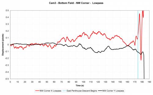
Try the "femr2 data analysis" thread for that discussion going round in circles.
Replicate it. You have the data.
Rather than complain/doubt, just do it. It's not rocket science.
No need to replicate it. I don't doubt at all that I get the same (or similar) result. What I doubt is that it is of any use.
It's overreaching interpretation that is misleading imo.
Sure, you could put it that way.
I'm continnually reminding folk here to look at trend, not instantaneous behaviour. To remember that the data is smoothed. To cross-reference between displacement, velcoity and acceleration to ensure a clear understanding. To cross-reference between viewpoints to interpret motion.
Be cautious. Be conservative. Don't over-reach on interpretations.
Yet again... I'm confident that the general trend is "true", and the same trend emerges from multiple different smoothing and derivation methods.
Yet again, I agree with all that.
Yet again...

Couple-o-different smoothing and derivation methods there. Very similar trend.
Between 12.5 s and 15 s, the "interesting period" when "about" freefall and some >freefall occur, the red SG curve has about 9 local minima and 8 local maxima. It drops below FFA at 12.76 s and never goes below 39 ft/s. Yet I find that the velocity curve seems to go over FFA no later than 12.6 s, exhibits an average acceleration of -41.81 ft/s
2 for more than 0,7 seconds between 12.59 s and 13.31 s. If the acceleration curve is in any meaningful way derived from the velocity curve, it must show a period of under -41 ft/s
2 somewhere; if not, if the trough is not deep enough, it must of necessity be wider, to preserve the area under the graph, which is the integral of the acceleration = velocity. If you underestimate the peak fall acceleration, you may overestimate the duration of that >FFA period. Etc.
At the same time I see that the poly10 and poly 50 curves show the same general trend, with about the same uncertainty and imprecision.
Those acceleration curves are bitches. The more they show, the more you are bound to get wrong.
I'm sure that you'd prefer that to be the case.
Again, you misinterprete my drift
")


 ) discrete (and basically arbitrary) points that you then smooth witzh S-G?


