That's not quite right, is it? Apparently, you only read the caption, not the text. Or did you not track down the original?
This is what I found - from
http://data.giss.nasa.gov/gistemp/2005/
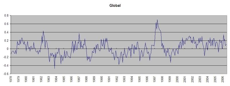
Your contention seems to be with the satellite measurements. If there were a discontinuity at 1982 - when satellite measurements of sea surface temperature replace ship-based measurement, then perhaps you'd have a point. But it appears that the current linear rise goes back to at least 1975 (and it's a very nice straight line, as these things go). Since there's a clear demarcation between the satellite and ship-based measures, you can't call it a mish-mash, can you?
Following the citations, it would appear that the satellite measurements are calibrated against ship-based measures, so this mixing is a non-issue.
Why would you assume the graph mixes tropospheric and ground data?
I'm also kinda confused - you seem to be contrasting the two data sets, Spencer and Christy vs Hensen. But if it looks to me that if you plot the two on the same scales, they'd be in pretty good agreement - jot down in '85 and '92, peak in '98, overall about a 0.4 degree increase from 1980.


")