• Quick note - the problem with Youtube videos not embedding on the forum appears to have been fixed, thanks to ZiprHead. If you do still see problems let me know.

Why do people hate comic sans?

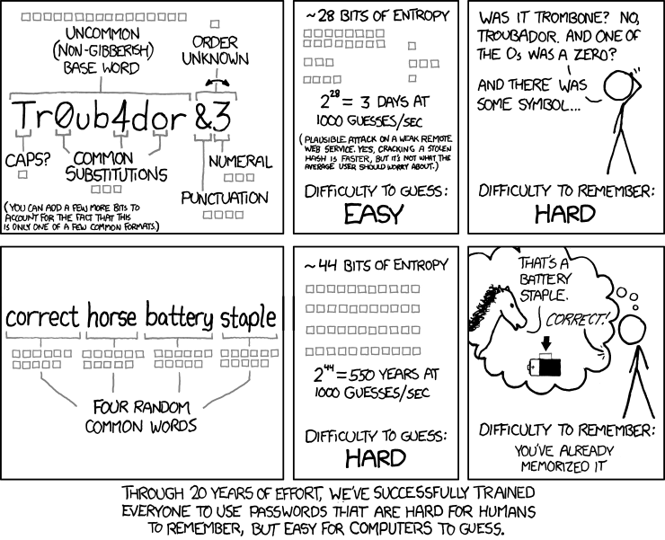
Our new company policy expanded the password requirements to change it every three months, with a minimum of 15 characters, at least one upper-case character, at least one lower-case character, at least one special character, no three repeated characters, and not equal to any of the last 10 passwords used.

Thus ensuring that one has to write down the password somewhere in order to remember it.

IHateThisSh*tALot
 
Nothing wrong with writing down passwords. If my house gets burgled (and they find where they're written) I can change them. That sounds like a crap policy, though.
 
Our new company policy expanded the password requirements to change it every three months, with a minimum of 15 characters, at least one upper-case character, at least one lower-case character, at least one special character, no three repeated characters, and not equal to any of the last 10 passwords used.

Thus ensuring that one has to write down the password somewhere in order to remember it.

According to Stephen Fry on the UK comedy quiz QI, this is a perfectly sensible thing to do. How many burglars or corporate saboteurs will look on the inside cover of the 4th installation cd under the stack of booklets and spare cables at the back of your desk drawer?
 
I often use this font if I want to type something that children might want to copy from because the a looks more like a handwritten one, and because it is without serifs, obviously.

But whenever I do, someone will pop up over my shoulder and say something like "Comic sans!!??!??!? Ewwwww!".

Why the hate?

For exactly that reason - it's childlike in its appearance and it feigns a casual attitude, when in actual fact it's been thoroughly thought through and someone has intentionally used it to appear over-friendly. Fine for your purpose where children are concerned, condescending for the wider use.

It's also commonly used in warnings and notices, where someone is telling you what to do, but think they're doing it in a friendly and approachable way. It's the font equivelent of a big fake 'have a nice day!' that really sometimes just means '**** you'.

If you want to appear friendly, personal or casual, then be friendly and casual and hand-write the damn thing! Don't fake it.
 
Last edited:
According to Stephen Fry on the UK comedy quiz QI, this is a perfectly sensible thing to do. How many burglars or corporate saboteurs will look on the inside cover of the 4th installation cd under the stack of booklets and spare cables at the back of your desk drawer?
That would be hard to find, which is why I keep it on a sticky note on my monitor.
 
For exactly that reason - it's childlike in its appearance and it feigns a casual attitude, when in actual fact it's been thoroughly thought through and someone has intentionally used it to appear over-friendly. Fine for your purpose where children are concerned, condescending for the wider use.

<snip>


You're being condescended to by a typeface?

That's pretty rough, man. My condolences.
 
xkcd has a comment about this, of course.

password_strength.png
 
Lol. I recently had to reset someone's password. I set it to something like "!1lIlI|Il¦i!1l" and printed it off for them in sans-serif. They had annoyed me.

The BOFH approach, heheh. And in style, users in general do annoy you, right?

On topic: I like Comic Sans for posters, signs and such that you print out and tack somewhere. It is easily readable and conveys a non-official style.

Obviousy, if I wanted to be official, I'd use Ariel Black.;)

Hans
 
Last edited:
The BOFH approach, heheh. And in style, users in general do annoy you, right?

On topic: I like Comic Sans for posters, signs and such that you print out and tack somewhere. It is easily readable and conveys a non-official style.
Obviousy, if I wanted to be official, I'd use Ariel Black.;)

Hans

And that's exactly the usage where I hate it the most. In particular in Universities or schools. I can tolerate it if it says "Free Food left over from teaching committee meeting", but not much else (and if the lady -- it's always a woman -- who made the sign had used a different font, she would score mighty with me).
 
Last edited:
I often use this font if I want to type something that children might want to copy from because the a looks more like a handwritten one, and because it is without serifs, obviously.

Thank you for pointing this out. My daughter was struggling reading the word "and" this weekend which was strange. But (because of this thread) I noticed that the homework she was reading had the a style instead of a. I mentioned this to her teacher, we'll see what she says.
 

Back
Top Bottom