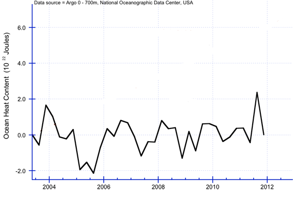
Thank you for detecting the addition of garbage in the wikipage about Argo. That home made image was uploaded last october 18th by user Leobond (who writes mainly about home computing, but also about Keynes and a pot-pourri of subjects). It's just an orphan image, probably a made-up one. How do I know? First, I looked up using Google special image searching feature and it knows only that image and its thumbnail. Secondly, for that image to aspire to fool anyone it would have to be consistent not only with data, other images developed by other authors, but also it would have to be consistent with how the Earth works. For instance,
you placed there a jump of 2.7
. 10
22 J from Southern Autumn 2011 to Southern Winter 2011 -it's the only available interpretation of the X-axis, so, don't insist otherwise-. That jump means a net radiative mean absorption of 6.8 W/m
2, that is almost 3% of the sun energy the planet gets that is not reflected as shortwave radiation (Calling deep ocean waters to justify this would be even more ludicrous). If you take a closer look to the graphic -an authoritative one- provided by macdoc you might appreciate that changes as large as 2.7
. 10
22 J occur during longer periods of time, consistently with an Earth as it really works.
You have to find yourself the way to the other obvious mistakes in the image you hotlinked. For that, you may be interested in answering these questions first as they leave you one step away from those mistakes:
Does ocean, land, atmosphere -and all together- contain the same "heat" during July and January? Why? Take averages if you want, the answer is pretty obvious.
Do representations regarding heat content of masses need some kind of "deseasonalization"? Why? If so -or other process is involved-, explain how is it done.