• Quick note - the problem with Youtube videos not embedding on the forum appears to have been fixed, thanks to ZiprHead. If you do still see problems let me know.

Ugly Buildings

[qimg]http://www.dreyeckland.com/fotos-unserer-internetseite/die-fotos-von-muttenz/die-romisch-katholische-kirche-in-muttenz[/qimg]

a church in my town.
no wonder we have so many Atheists :D

I am outraged - this seems to be a clear theft of my design for stacking empty cardboard boxes in my loft. :eye-poppi
 
My vote is on the denver museum of art: http://www.tufts.edu/alumni/magazine/winter2008/images/features/photo_denver.jpg

It looks kind of like the mess of random polygons you get when the fan on your graphics card dies and GPU overheats.

I love that one.

I guess that's a way of building architecture. Do something daring, see what comes of it. Sometimes it succeeds (Wright's Fallingwater for example), sometimes it fails (I've seen some Brutalist examples in this thread that were bad), sometimes it's a partial win (Gehry's Guggenheim, which is widely praised for its architecture but not so apt at displaying art, apparently).

And you can love them or hate them, but that should be allowed. I don't think a hated building is a waste if it was an attempt to come up with something new and exciting.

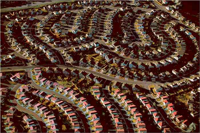
What I loathe is buildings that don't add anything to the world except floorspace. And they're everywhere! The kind of buildings noone purposely puts their photolense on, because they're so bland. A lot of glass skyscrapers are like that, but also many many cheap appartment buildings and

Stuff like :
The Netherlands:
dscf4714.jpg


Dubai:
dubai_skyscraper_02.jpg


Miami:
suburbs.jpg


Denver:
denver_suburbs.jpg


Sarajevo:
p256337-Sarajevo-Sarajevo_Suburbs.jpg
 
What do you think of buildings that aren't done yet? Here's one that was being built across the street from my workplace last January. I caught it when several different stages of construction were visible from bottom to top, including a guy using a welding or cutting torch near the bottom of the picture and some reflective water on the "floor" of a level that's still open to the weather near the middle of the picture. I thought it was a fascinating sight, but of course it's not what anybody has in mind for how a building is really supposed to look...
 

Attachments

  • New Building 640.jpg
    New Building 640.jpg
    51.3 KB · Views: 15

Hmm, well, it's a matter of taste, I guess. I'm no fan of brutalism, but I suppose it has a certain... ignorable simplicity, if I'm allowed to make up a term. Some of those buildings you can pretty much just ignore, as they're glorified rectangles with regular ramps or windows or whatever. Unless they're placed among much better looking buildings, for me they kinda stop registering except as an abstract "it's there". I mean there is no real reason to look for details or anything.

Again, I'm not saying it's not ugly, but it's most of the time an ignorable kind of ugly. It's not the kind of ugly that jumps out and says "look at me!"

Not being an architect or artist myself, I don't really go out of my way to look at buildings I'm not going to, so if it doesn't stand out, I can just ignore it. Basically there's something to be said for at least having the decency to make it bland if it's going to be ugly anyway ;)

The Scottish Parliament building, on the other hand... seems anything but ignorable. For me it's butt ugly AND all that haphazard asymmetry draws attention to it too. I think I would have bumped it a bit higher up that list.

Though Peter's statue definitely deserves a bump upwards too :p
 
Since this thread stumbled back into life from the dead, I submit for your consideration: The Modern Art Museum of Fort Worth, Texas.

Yes, this is an interior shot, but it captures the essence of the structure perfectly. I took mostly interior shots to document it for possible use as a futuristic prison scene location for a video. This is probably the brightest and most inviting location in the museum.

Beanbag
 

Attachments

  • MAMFW.jpg
    MAMFW.jpg
    30.5 KB · Views: 7
Last edited:
As for those pictures from Sarajevo... well, that's what I don't "get".

The commies turned to brutalism as, basically, a way to cheaply house millions of workers. They weren't supposed to be beautiful, and sometimes not even nice to live in.

They had a problem like, basically, that by 1917 Petrograd's industry had exploded and the city hadn't kept up. There were a lot of apartments where as much as 16 workers were not as much room mates, as hot-bunking. Moskow wasn't that far behind. Stalin's forced industrialization caused a very sharp urbanization too, which just made the problem even worse, and spread it to other cities too. They had to pretty much move a hundred million peasants into cities, and fast.

The other Eastern Bloc countries followed similar patterns, though to different extents. Some were already more urban.

And the fact that the economy was crap, also didn't help.

So they turned to, basically, cheap, mass-produced, blocks of flats. Aesthetics were not a goal, housing the most people with the least cost was.

But that's kinda the point. Those were not supposed to be artsy buildings or anything.

And when they wanted something nice, like the villas of the elites, they didn't go brutalist about those.

Basically those buildings in Sarajevo have an excuse.

Now witness the kinda similar phenomenon in the West. Some of those brutalist abominations actually were supposed to be avangarde and artistic, and they hired some celebrity architect to... make a misshapen concrete box.

W.T.H.?
 
Last edited:
The Bank of America Tower in Hong Kong is hideously ugly, especially in contrast to the high-tech, interesting towers around it.

I also think LAX is an ugly 'architect had a thing for the Jetsons' building.
 

Attachments

  • lax-airport-address-741583.jpg
    lax-airport-address-741583.jpg
    67.6 KB · Views: 4
  • b5469_1.jpg
    b5469_1.jpg
    64.8 KB · Views: 3
And in keeping with the Gray Mausoleum school of architecture, there's the Kimbell Art Museum, just across the street from the Modern Art Museum. The Kimbell is a real oddity: the building faces out over an open grassy area, but the parking lot and access from the street is at the rear, so everyone enters from the back. Fortunately, the interior is STUNNING, a real must-see if you're ever in FW. Kahn did a wonderful job with the interior. The arched ceilings and the lighting make the venue as big an attraction as the art.

Beanbag
 

Attachments

  • KAM.jpg
    KAM.jpg
    40 KB · Views: 2
Atlanta GA has abuilding called a flat Iron because thats what it looks like. Its historical though and I'm gad its there.
Fort Worth has one as well (even has the name chiseled in the stonework). They built 'em that way to take advantage of the thin slivers of real estate where roads came together at an angle considerably less than 90 degrees. I've got a picture of it somewhere in my archives. Pretty building, with carved stone gargoyles and ornate stonework.

Beanbag
 
Say what you like about the Catholic Church, they used to know how to build a beautiful church. Not any more, if the above monstrosity is any indication.

On my own hate list, the New De Young Art Museum in Golden Gate Park in San Francisco is hideous. It has been nicked named "The Aircraft Carrier" because of the wierd placing of the observation tower, but I consider that to be a unfair insult to aircraft carriers.

[qimg]http://www.internationalskeptics.com/forums/imagehosting/thum_18840491e1a7836b78.jpg[/qimg]

The Photo does not do it true ugliness justice.

Isn't that where the Rebels were hiding out on Yavin IV?
 
They tore down the ugliest building we had here on campus, the Mudd law school building.
Unfortunately, Google images apparently has nothing archived.
A remnant of the "fortress" school of architecture, it was essentially a big block of raw, unfinished concrete. There were even a large number of 1" holes in the exterior walls that everyone took to be mounting points for some sort of facings that were never applied...
Not so, we were told. It was supposed to look that way.
We used to give directions using the building for a marker... "Just go down this road till you get to the really ugly building, and then turn left...."
 
Since this thread stumbled back into life from the dead, I submit for your consideration: The Modern Art Museum of Fort Worth, Texas.

Yes, this is an interior shot, but it captures the essence of the structure perfectly. I took mostly interior shots to document it for possible use as a futuristic prison scene location for a video. This is probably the brightest and most inviting location in the museum.

Beanbag

The great irony with your post is that it is a Tadao Ando masterpiece. A stunning building.
 
Last edited:
They tore down the ugliest building we had here on campus, the Mudd law school building.
Unfortunately, Google images apparently has nothing archived.
A remnant of the "fortress" school of architecture, it was essentially a big block of raw, unfinished concrete. There were even a large number of 1" holes in the exterior walls that everyone took to be mounting points for some sort of facings that were never applied...
Not so, we were told. It was supposed to look that way.
We used to give directions using the building for a marker... "Just go down this road till you get to the really ugly building, and then turn left...."

Yes, an ugly building, but at least they tried something different. I'd prefer trying and failing to not trying at all, which is what they are doing now, with every building looking the same. Collegiate Gothic, I beleive is the term.
 

Back
Top Bottom