The SDO team told me the original colorized images were made in red, green, and blue. The red showed the 211Å filter, the green showed the 193Å filter, and the blue showed the 171Å filter. When you separate the three original colors they look (something) like this...
[qimg]http://img688.imageshack.us/img688/2593/sdored.jpg[/qimg]
[qimg]http://img63.imageshack.us/img63/237/sdogreen.jpg[/qimg]
[qimg]http://img694.imageshack.us/img694/5499/sdoblue.jpg[/qimg]
To me it looks like the composite was made by layering those three colored originals then placing a round darkening filter over the whole thing. That filter was maybe 20 pixels larger than the disk area of the three images, and that's what we're seeing as a sharp line. The filter was probably mostly a combination of red and green. The purpose, of course, was to make a pretty picture for public relations, so the amount and color of the filter would have been done to balance the input colors and to make the corona stand out.
Of course the separation can't be done perfectly because although we can pick out the red, green, and blue, any additional layers or other colors would become part(s) of those red, green, and blue results.
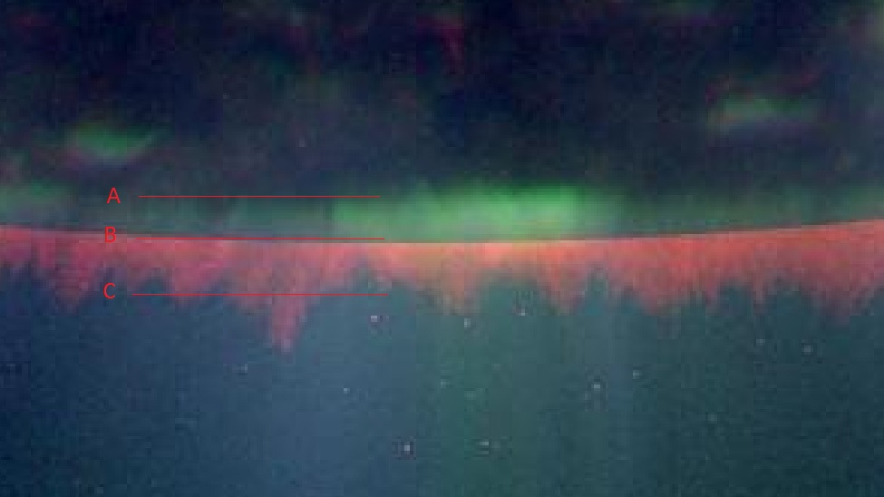
In the red image you can see that crisp division at Arrows "A" and "B". It goes pretty much all the way around the image like that. In the green separation you can see how that crisp division shows at Arrow "A", but at Arrow "B" there are just some distorted pixels, probably compression artifacts. Those differences would be the result of the reds and greens being sort of neutralized when laid over their own color.
In the blue image there are a few of those distorted pixels, but no crisp darkened division at either arrow. In my opinion the round gradient filter was a combination of green and red laid over the composite image. There would have been little need to dim the blue since it's obviously a much darker original. It could even be that the blue was a layer on top of the red, green, and gradient filter.
That explanation might be off by a bit, but it would explain the crisp edge
and the fact that so much of that size discrepancy shows as the green strip Michael mistakenly believes is significant to his claim.


")