How do YOU know the colour has changed…? Are you deliberately withholding evidence? And the style is certainly very similar over time…
The design and colourways of the Goodyear logo has developed over the years much like any other logo:
Original Logo designed in 1900
1960's Coverall patch
Keyline version used against white background
More usual present day logo reversed out of solid block
Depending upon it's use, it can be single colour (either reversed out of a colour or solid colour printed on)
Even in the photos you yourself provided it is clearly painted onto the various blimps using different stylings, sizes and you can even see that it is differently coloured in some of them (even though the photos are black and white).
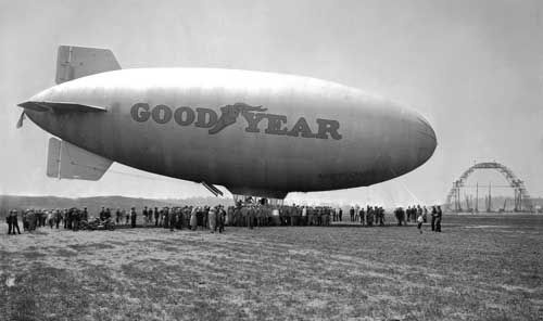
On this photo, the logo is the yellow with a thin blue keyline variant
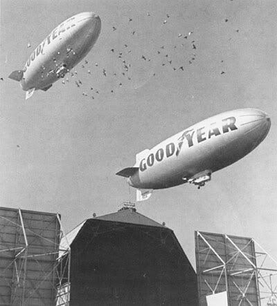
This photo from the 1960s shows the solid (presume blue) colour logo and much bigger than the previous 1929 photo.
You will also see in this photo that gloss paint/ink was used as the shiny reflection of the sunlight hitting the blimp partly obscures the logo (bear this in mind when considering the RR sighting with the sun reflecting from directly behind the viewers)
This is how people know Rramjet, by doing some research into other possibilities... An unfamiliar concept to you.
However, what matters is that it was designed as an advertising logo and if you can cite cases where such logos are NOT designed to be clearly visible you might have a case.
Well this logo is meant to be clearly visible too:
However, if you're at the wrong angle or too far away, it still aint going to be clear. And as the Goodyear blimp delivers it's advertising message mostly by floating 200 feet above a football stadium and other sports events, it's optimum viewing distance nor angle would have been attained when it was being viewed from about 1 mile away and as it was at an altitude of 5000 feet. Through a pair of binoculars of questionable quality from the rocking platform of a fishing boat in the tidal section of a river estuary.
However, Goodyear wanted to there to be no mistake
whose blimps they were (for example here -
http://www.goodyearblimp.com/archive/). Even if the logo was just “black and white” (because obviously colour had not been invented yet) it is clearly a highly visible logo!
It is only a highly visible logo in a highly visible blimp, the further that blimp get away, the less visible both the blimp and logo get.
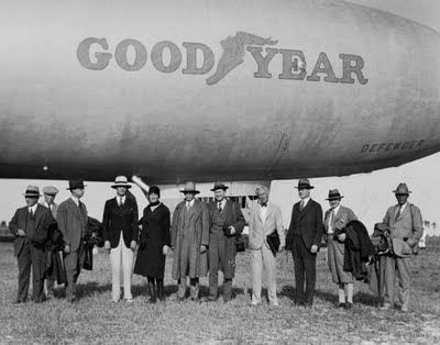
And besides Goodyear made blimps for the navy and navy reserves too. They didn't have the Goodyear logo on them at all and they were just as proud of those as evidenced here in this Goodyear ad from 1945:
Did I get enough blimp photos in this post for everyone? If not here are few more examples of the differing style of Goodyear logo on blimps over the years:
Blimp 1920's
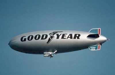
Blimp 1970's
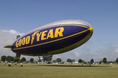
Blimp 2000's