Actually During the late Jurassic, Gondwana was where South America is, Antarctica was only a little farther north than it is today.
commons.wikimedia.org/wiki/File:Earth_During_the_Jurassic_Time_Period.PNG
The flora of Antarctica was tropical b/c of the difference in world-wide climate.
Just a couple of comments. You know -or are going to learn soon- that I consider elements like this one absolutely irrelevant to any issue related to AGW.
One comment is a question in chunks: What kind of "tropical flora" do you think there was in any place of Antarctica other than the Antarctic Peninsula? Were there flowers in Antarctica 145 million years ago?
The other comment may be put as a question, but a rhetorical one: Do you think that the north and south poles in that figure are the geographic ones or the magnetic ones? Same as today? closer? farther?
Parts of the Antarctica in that image are now at my latitude, and we have here exotic palmtrees of those many species that tolerate frosts down to -7°C (20°F). Indigenous palmtrees, also tolerating frost and snow, grow some 400 miles closer to the Equator.
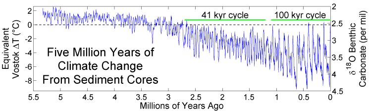
I cannot show a dramatic line chart b/c the time period since the industrial revolution is too short to be statistically significant on a chart of temperatures since the Jurassic period.
en.wikipedia.org/wiki/Geologic_temperature_record#mediaviewer/File:Five_Myr_Climate_Change.png
This shows the wild highs and lows, and is NOT a hockey stick.
You can show it. You must show it. It's not a matter of wide in those graphics. It's a matter of height. And it's pretty impressive. It shows dramatic changes in a 100 years that are only matched by dramatic changes like massive eruptions, meteorite hits, massive release of methane from different origins. And it shows a planet changed in a way that you -you meaning your person- have to go back eons to a planet with different continents in different places, different atmosphere, different living beings, those and much more all just to make a bit of sense in what you are saying.
The dramatic hockey stick charts use less than 200 years. When viewed in this longer period it doesn't DISPROVE global warming (global warming cannot be reasonably denied) It just shows a more statistically significant "snapshot" of variations. I will repeat myself yet again...I agree with virtually everything you all are saying, just that to truncate a line/mountain chart to several hundred years, and show a "Major change" during that short period is deceptive. OK, maybe I am not clear and too picky. I have seen too many politicians on both sides use dramatic line graphs where a line suddenly plunges downward or spikes, to make a point. You can make a chart look like anything to support any supposition, and people will nod and agree that there is a spike or dip...
By "the last I'm going to say" I meant at this posting...not that I'm leaving the forum...I have the opportunity of learning much from you all who obviously have much more knowledge about global warming than I have..!
And here comes my point. I'll comment this to you just to make some conversation and explore the possibility of a productive discussion with you. I'm not still convinced you came here to discuss science and facts, but to share a vision, and that's OK with me, but not the goal of this thread.
I'm aware we're going into a period of global temperatures climbing again, and there's an increasing buzzing coming from the denialist camp leaving behind them any pretension of a non existent AGW and changing the focus into "it's inevitable; it happened before; it means nothing indeed; the planet will adapt as it always has done; we can cope (the long list continues)". Your words so far sound a bit like that, but I have to take them as they look: an honest sharing of an honest opinion.
What I see in what you're saying is a stance I could never share. What happened one million years before today doesn't matter much because it has no perceptible bearing in the present other than the continuity in a causal universe. The planet has come to be some way because it was some of many many different ways in many different points in the past. But what made hot some day one million years BC has only a connexion with the present if the same causes are working, not if similar thermometers show the same.
It seems like people -does this include you?- had never learnt from their daily life. If they live in Pennsylvania, they see the seasons passing, high sun, long days, hot during Summer, sun laying low, short days, chilly Winters. They also see that whether summer or winter the temperature starts being cool at dawn and climbs to a heigh about 2pm, or 3 pm or 4 pm, depending on how wet is the place. Of course, it doesn't happen that way as a clock, because there's some chaotic system called biosphere and a lot of variations, some of them called weather. But pretty much it works like that, do you agree?
Besides, if you are in a dry place, temperatures go up quickly during the day and plummet after sunset. If you are in a wetter place, water vapour, the most important greenhouse gas in the system, makes for warmer nights. If you are in the mountain and have less atmosphere over your head, temperatures will plummet dramatically. If you leave PA and go to Atlantic City, temperatures at night won't fall as much as inland. Sea water has an impressive thermal inertia and they'll provide the needed thermal energy to sustain that. But anyway the temperature of the water at the shore will fall one or two degrees Celsius, and far from the shores, a few tenths, in spite there's a lot of mixing and deeper waters come up to replace the slightly cooled ones.
Does that description sound familiar to you? Can you connect the experience of being a living person with that? I hope you do, because what that is telling you is that -for any practical purpose- all the energy the planet gets from the Sun during the day, goes out into space the very same day. That truth is unquestionable. You could search, calculate, integrate, choose the day, choose the weather pattern, choose the exact second that 24-hour period starts and ends, and you'll get it off cases that the planet gets 1000 from the sun and gives back 979 or 1024, with an average that should be 1000 if not because of humans -currently some 997 or 998 because of humans-.
And that brings the conclusion. The planet as a whole is on the road of becoming a tiny bit hotter today, just because yesterday it was a bit hotter than the o'le times, but most of all, because it cannot give back to space the energy it gets from the sun as easy as it did decades ago. It needs to go hotter to match the equation. And the reason is pretty much greenhouse gases, and the human fingerprints are all over the crime scene: the gun, the bullets, the windows, the table, the personal cards on the night table with the handwritten FU in them.
It's just only today. The incoming sun energy may vary -it varies a whole lot- and still is the same conclusion. In January the Earth gets 7% more energy per day than in July. Anyway, as an average, in January the Earth is almost 4°C cooler than what it is in July. One should think the opposite, but no, it is clearly that way. It only has to be with the daily equation: heat in - heat out.
Human being are affecting the far most important part of the equation in the mid-term: greenhouse gases that can't be degraded or wiped out easily. The Earth system, with its chaotic behaviour, its contribution to the most important greenhouse gas (water vapour) and its oceanic thermal inertia -besides its somewhat important ice/snow-covered regions- keeps making our daily news. More CO2, should promote more water vapour, but cool oceans oppose to that. So, the system behaves chaotically but it will match in the mid-term the pattern greenhouse gases but water vapour have set to it, and that's because there's a lot of cold water down there, in the ocean, but it's warming and it's not going to remain cold forever.
And that's pretty much it. We can add loops and discuss Jurassic, hockey sticks, the bulging glance of Monckton and a lot of paraphernalia designed to distract us from the picture.
I can accept you have your interests and respect them, but don't expect that reality shows your interests match the truth.
 ...you are in a CLIMATE CHANGE thread...not one chart is being used incorrectly in that context....despite your protests and you are simply dodging in my view.


 !
!