Ok, finally here it is.. Michael Jackson is Alive!?

Mr.Herbert

Graduate Poster
Joined
Feb 23, 2007
Messages
1,449
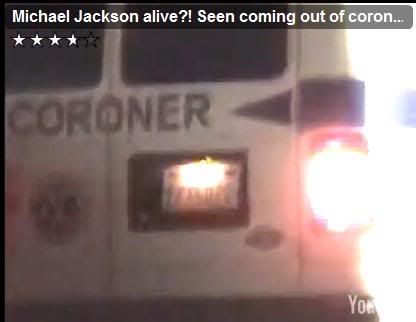
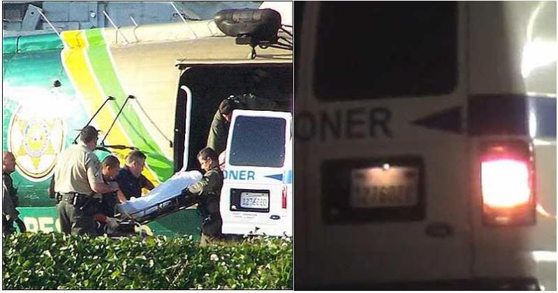
You knew it was bound to happen. Michael Jackson as this video suggests, was seen getting out of the back of the coroners van.

I'm not sure if it made it on YouTube yet... here is the live link page:


http://www.liveleak.com/view?i=9b8_1251194026

edit to add YouTube video:

 
Last edited:
looks like a different van....

coroner.jpg
 
Yeah I was in the progress of making a topic about this yesterday before my computer crashed.

I took that image and circled some of the biggest errors.

mikefake.jpg


1 (Blue): As you guys already pointed out the font is completely different. It seems they didn't even try to use the original font and they didn't pay much attention to the arrow on the right side which is shorter in the video.

2. (Green): The "1" on the license plate in the video is set up higher than all the other numbers. Not to mention the color of the numbers look different to me. Blue on the picture and red on the video...

3 (Red): Um...Well. I think they missed something!

4 (not circled): I also noticed that the key hole area on the back door handle is on the top in the image and on the bottom in the video.

This is obviously some sorta prank, but I guess we will see how far they carry it.
 
Last edited:
I guess pointing out that light levels can alter the way a camera reads and projects an image takes all the fun out of this, huh? :boxedin:
 
I guess pointing out that light levels can alter the way a camera reads and projects an image takes all the fun out of this, huh? :boxedin:

You're a perfect example of why we can't have nice things!;)

In all seriousness I will agree that it does affect perception, and it that could be used to argue some of the points, but the font argument cannot be argued with a simple "Swamp gas and light reflecting off of Venus" explanation. I work with fonts everyday and I can say 100% without a doubt that those two fonts are different. The one in the picture is similar to a style of "SimianText" while the one in the video almost looks like a standard "Arial" style font.:cool:
 
In all seriousness I will agree that it does affect perception, and it that could be used to argue some of the points, but the font argument cannot be argued with a simple "Swamp gas and light reflecting off of Venus" explanation.


I respectfully disagree. We're talking about different cameras shooting at different angles with different levels of lighting. The white of the van in the first picture is automatically going to cause some overexposure which can absolutely affect the lettering (the "R" especially looks unrealistically misshapen).

I'm not saying it's IMPOSSIBLE they're different fonts, but the circumstances do exist which could create an illusion that may not represent reality.
 
from looking at the video, i think its most likely the same van, and someone who works at the coronors just playing a prank
 
Yeah I was in the progress of making a topic about this yesterday before my computer crashed.

I took that image and circled some of the biggest errors.

http://img8.imageshack.us/img8/2257/mikefake.jpg

1 (Blue): As you guys already pointed out the font is completely different. It seems they didn't even try to use the original font and they didn't pay much attention to the arrow on the right side which is shorter in the video.

2. (Green): The "1" on the license plate in the video is set up higher than all the other numbers. Not to mention the color of the numbers look different to me. Blue on the picture and red on the video...

3 (Red): Um...Well. I think they missed something!

4 (not circled): I also noticed that the key hole area on the back door handle is on the top in the image and on the bottom in the video.

This is obviously some sorta prank, but I guess we will see how far they carry it.

there's one more:

Different back window - the coroner van in the first pic has "bolts" in the four corners - the one in the 2nd doesn't
 
I respectfully disagree. We're talking about different cameras shooting at different angles with different levels of lighting. The white of the van in the first picture is automatically going to cause some overexposure which can absolutely affect the lettering (the "R" especially looks unrealistically misshapen).

I'm not saying it's IMPOSSIBLE they're different fonts, but the circumstances do exist which could create an illusion that may not represent reality.

They absolutely are different typefaces. On the left it seems to be some variant of Eurostile (the R has really extreme proportions but it's the same style of geometric sans serif), on the right it's harder to say, looks like some kind of DIN.

http://new.myfonts.com/fonts/agfa/eurostile/
http://new.myfonts.com/search/din/fonts/

Put 'CORONER' into the sample text field and compare.
 
I respectfully disagree. We're talking about different cameras shooting at different angles with different levels of lighting. The white of the van in the first picture is automatically going to cause some overexposure which can absolutely affect the lettering (the "R" especially looks unrealistically misshapen).

I'm not saying it's IMPOSSIBLE they're different fonts, but the circumstances do exist which could create an illusion that may not represent reality.

Well as long as it's respectful!;)

I think you are looking to deep. I just don't think the lighting is doing that much to warp the font. Check out this picture as it gives a more solid grasp on the coroners logo.

http://laist.com/attachments/la_zach/redlinecoroner.jpg

I went back and watched the video a couple of times and paused it on the clearest moment I could and the C doesn't come in as far and the O is far more rounded.

Arus808 said:
Different back window - the coroner van in the first pic has "bolts" in the four corners - the one in the 2nd doesn't

I thought that at first as well, but the bolts are black so they can easily be missed in the video.

tuc0 said:
some variant of Eurostile
You blew my "SimianText" theory right out the window with that one. I totally forgot about Euro. I did a couple of side by sides and it seems to be "Eurostile Bold" so you were right on the money! I still think the other is just plain ol Arial though. It just doesn't strike me as DIN, but then again I was wrong about the Simian...Some designer I am!:(
 
Let's say it was the same van, same day, confirmed by 10 credible, independent sources.

So what? Did YOU see Michael Jackson? All I saw was a blurry white shirt.

EDIT: And why was this fellow video taping here? Assuming this was a paparazzi, why was he the only one there?
 
Last edited:
i think the font looks closer to how it should in this frame, even though its not as clear

corvan.jpg


i can see this going the way of osama's nose, lol
 
You blew my "SimianText" theory right out the window with that one. I totally forgot about Euro. I did a couple of side by sides and it seems to be "Eurostile Bold" so you were right on the money! I still think the other is just plain ol Arial though. It just doesn't strike me as DIN, but then again I was wrong about the Simian...Some designer I am!:(
No way that's Arial. I hate Arial especially for the ugly way the uppercase R looks and would recognize it anywhere. That disgusting ink trap! BRRR! :covereyes

picture.php


:D
 
Aren't there other news photos of the coroner's van (from other angles) that could be used for comparison? There must be a million of them out there.
 
It says that RTL produced the video to "test the willingness of conspiracy theorists" to jump on a Michael Jackson CT. Apparently a broadcast aired five hours ago which showed how the hoax spread over the internet. I'll see if i find it somewhere (don't know if they have an archive, i avoid RTL like the plague).
 

Back
Top Bottom