You are using an out of date browser. It may not display this or other websites correctly.
You should upgrade or use an alternative browser.
You should upgrade or use an alternative browser.
Moderated Global Warming Discussion
- Thread starter Tricky
- Start date
- Status
- Not open for further replies.
CurtC
Illuminator
OK, I just downloaded the data, smoothed it (averaged each point with the data from the previous ten years to the subsequent ten years) and plotted that. Here it is:
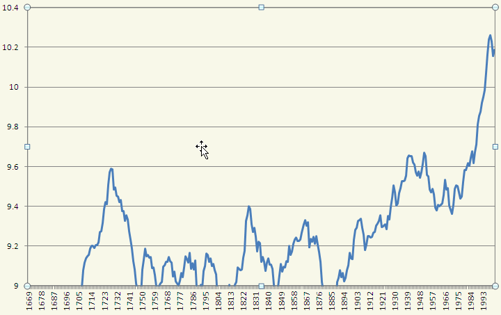
The data on the left is below the scale, probably due to the Little Ice Age. I'm not sure about the bump in the early 1700s. But recent data sure does look like the CO2 graph.
The data on the left is below the scale, probably due to the Little Ice Age. I'm not sure about the bump in the early 1700s. But recent data sure does look like the CO2 graph.
casebro
Penultimate Amazing
- Joined
- Jun 14, 2005
- Messages
- 19,788
Yes but there s still the cause and effect- warmer oceans release more CO2 into the atmosphere, so not so simple as one graph shows.
We would need CO2 content of the atmosphere since the little ice age to regard whether the recent increase (150 years) is strictly man made, or the result of warming as opposed to being the cause.
We would need CO2 content of the atmosphere since the little ice age to regard whether the recent increase (150 years) is strictly man made, or the result of warming as opposed to being the cause.
lomiller
Penultimate Amazing
- Joined
- Jul 31, 2007
- Messages
- 13,208
excellent work CurtC
Pretty clearly the version in the OP had it's scale selected in order to try and mislead.
There is another feature of the graph in the OP that goes beyond misleading into flat out lying. The dashed line that says "climate model predictions" is complete fiction. climate modes typical predict anywhere from 2 - 4.5 deg (with a mean of 3) of warming every time CO2 levels double. To get the 8 degrees of warming they show CO2 levels would need to double 2-4 times,
From pre-industrial levels of ~280 ppm that takes you to 1000 - 4000 ppm CO2 before climate models would show that much warming. Current CO2 levels are just under 400 ppm so they are not even remotely close to showing what temperatures climate models predict. In fact on a global scale climate models predict temperatures that are quite close to the ones actually measured.
lomiller
Penultimate Amazing
- Joined
- Jul 31, 2007
- Messages
- 13,208
Yes but there s still the cause and effect- warmer oceans release more CO2 into the atmosphere, so not so simple as one graph shows.
While it's feared that will happen at some point, at present the oceans continue to absorb 50% - 60% of the CO2 we produce as tehy have done since the industrial revolution.
We would need CO2 content of the atmosphere since the little ice age to regard whether the recent increase (150 years) is strictly man made, or the result of warming as opposed to being the cause.
Fossil CO2 coming from burning coal and oil has a different isotope signature. Pre-industiral CO2 levels were stable at ~270ppm - 280ppm for thousands of years and isotope signatures show that 100% of the 120ppm added to the atmosphere since then are of fossil origin.
CapelDodger
Penultimate Amazing
no, as far i unerstood, its mainly do to gravity. Sure rebound is also a factor.
That would mean a hump of water the best part of 100m high due to the mass of Greenland's ice, which I find hard to credit. I'm not going to argue from incredulity, obviously, but I'd like to run my eye over the raw numbers involved.
CapelDodger
Penultimate Amazing
http://www.bbc.co.uk/news/science-environment-19047501
Ex-sceptic says climate change is down to humans
In a US newspaper opinion piece, Prof Richard Muller says: "Call me a converted sceptic."
Of course Muller goes on to say that there's probably not a problem anyway, polar bears are just tickety-boo, the Mid-West drought is a "warm period", climate scientists are politicised and not to be trusted, China and India need to step up, and all the usual.
The attribution of warming to AGW is actually the weakest part of the product.
Meanwhile the denier world, far from relying on Esper, baked their own spoiler (or half-baked, in this case). Somewhat bizarrely, I doubt either BEST or Watts's sad effort will ever see the light of peer-reviewed day. It's just off-stage willy-waving.
casebro
Penultimate Amazing
- Joined
- Jun 14, 2005
- Messages
- 19,788
So, the carbon isotopes in the coal and oil we have been burning was sequestered out of the atmosphere millions of years ago, and locked into the plant matter.
You seem to be saying that the ultimate source of the isotopes has changed. Two isotope profiles, two sources, eh? A big bang source and another? with clear demarcations in time? ALL the old isotopes got sequestered into coal, before the new got into the atmosphere? Is there a natural method to filter carbon by isotope?
And where did the 'new CO2' with it's different isotopes come from?
Also about that green line, isn't that simply a regression line? (Statistical term.)
Of course the problem with the regression is that it isn't really affected much by outliers right? And basically all the 1900s data is an outlier when compared to like, 400 YEARS of previous temperatures.
Of course the problem with the regression is that it isn't really affected much by outliers right? And basically all the 1900s data is an outlier when compared to like, 400 YEARS of previous temperatures.
lomiller
Penultimate Amazing
- Joined
- Jul 31, 2007
- Messages
- 13,208
You seem to be saying that the ultimate source of the isotopes has changed. Two isotope profiles, two sources, eh?
I'm not sure what you mean. Different Carbon isotopes tend to accumulate in different carbon reservoirs so the ratio if C12 C13 and C14 is different in fossil fuels than it is in the atmosphere. You can work out how will change if you add Carbon that was locked up in fossil sources, and we observe exactly these changes in atmosphere.
From burning fossil fuels. I told you that above.And where did the 'new CO2' with it's different isotopes come from?
lomiller
Penultimate Amazing
- Joined
- Jul 31, 2007
- Messages
- 13,208
Also about that green line, isn't that simply a regression line? (Statistical term.)
Of course the problem with the regression is that it isn't really affected much by outliers right? And basically all the 1900s data is an outlier when compared to like, 400 YEARS of previous temperatures.
The change in temperature isn't linear over that entire time so modeling it with a line is a bad choice. This would be a lot more apparent if they hadn't played with the scale to try and hide it.
Wangler
Master Poster
- Joined
- Feb 20, 2008
- Messages
- 2,228
Woah CURTC! How did you do that?
I just opened the DAT file in SPSS... I'm only an amateur with this program though. I'll see how I go. XD
Here is a fun website:
http://woodfortrees.org/plot/
Allows you to make all sorts of graphs, and comparisons.
highly recommended.
rjh01
Gentleman of leisure
So, the carbon isotopes in the coal and oil we have been burning was sequestered out of the atmosphere millions of years ago, and locked into the plant matter.
You seem to be saying that the ultimate source of the isotopes has changed. Two isotope profiles, two sources, eh? A big bang source and another? with clear demarcations in time? ALL the old isotopes got sequestered into coal, before the new got into the atmosphere? Is there a natural method to filter carbon by isotope?
And where did the 'new CO2' with it's different isotopes come from?
Carbon 14 is made in the upper atmosphere. It has a half life of a few thousand years. Carbon that is in plants and animals would have some of this carbon 14 in them. However coal, which has been underground for millions of years would not have any of this carbon 14.
See this link for more information http://en.wikipedia.org/wiki/Carbon-14
Last edited:
Reality Check
Penultimate Amazing
That graph is little to do with global temperatures since it is titled "Central England temperatures and Global CO2 Emissions" (my emphasis added).I think this data collected is pretty damning evidence against the theory that global warming is man made.
Here, look at the CO2 emissions compared to the general increase in temperature.
https://gxzjlg.bay.livefilestore.co...6-ZQy/central-england-temperatures.jpg?psid=1
The inability to tell the difference between local and global temperatures is "pretty damning evidence" for the ignorance of the author.
The graph actually lies because the author has drawn a linear trend though the temperature data. They assert that the steep (almost exponential) increase in CO2 emissions should be reflected in a steep (almost exponential) increase in temperature. And because they have draw a line, GW is not due to CO2
 !
!FYI: OhMan
Global temperatures have not increased linearly since the 1650's (the start of the graph): Temperature record of the past 1000 years.
Aepervius
Non credunt, semper verificare
Agreed I would have expected some impact on CO2 numbers from the Icelandic eruption of 1783-84
Why ? The CO2 disperse relatively rapidely and you see only 1 point per year.
Trakar
Penultimate Amazing
- Joined
- Oct 20, 2007
- Messages
- 12,637
I think this data collected is pretty damning evidence against the theory that global warming is man made.
Here, look at the CO2 emissions compared to the general increase in temperature.
https://gxzjlg.bay.livefilestore.co...6-ZQy/central-england-temperatures.jpg?psid=1
That is generally why it is better to stay away from blog science.
Where is the study from which this graph was excerpted?
Why would those units, and that particular (il-defined) single region be considered appropriate to estimate global changes based upon the human contribution to the natural carbon cycle loads?
Reality Check
Penultimate Amazing
That is correct - it is the line you draw when you have evidence to support the hypothesis that the data will follow a linear trend.Also about that green line, isn't that simply a regression line? (Statistical term.).
This is usually that the physics says that it should or that analysis of the data shows that no other trend will fit better.
As you say the data beyond 1900 are "outliers", i.e. does not fit a linear trend. Thus fitting a linear trend is rather dumb and deceptive enough (along with the rest of the points raised by other posters) to make this graph a lie rather than a mistake.
Oh, and a scale devised so as to cut off a significant amount of the data is soo much better? Don't act as though you are curing chart junk by making chart junk of your own. The axes should span at least the full extent of the data. The axes can span a greater extent if there is a reasonable comparison to be made. There are plenty of examples of charts that go from y min to y max and exclude a reasonable y=0 so as to emphasize the change, rather than a relative amount of change. Not that average global temperature charts should include 0 Kelvins, but the axis range at least should be chosen so as not to cut off low temperature data.excellent work CurtC
Pretty clearly the version in the OP had it's scale selected in order to try and mislead.
There is another feature of the graph in the OP that goes beyond misleading into flat out lying. The dashed line that says "climate model predictions" is complete fiction. climate modes typical predict anywhere from 2 - 4.5 deg (with a mean of 3) of warming every time CO2 levels double. To get the 8 degrees of warming they show CO2 levels would need to double 2-4 times,
From pre-industrial levels of ~280 ppm that takes you to 1000 - 4000 ppm CO2 before climate models would show that much warming. Current CO2 levels are just under 400 ppm so they are not even remotely close to showing what temperatures climate models predict. In fact on a global scale climate models predict temperatures that are quite close to the ones actually measured.
- Status
- Not open for further replies.