• Security incident: ISF was recently accessed by intruders. Please change your password, and change it anywhere else you used it. Read more

Merged Mercator projection to be phased out?

It's funny and interesting to me.

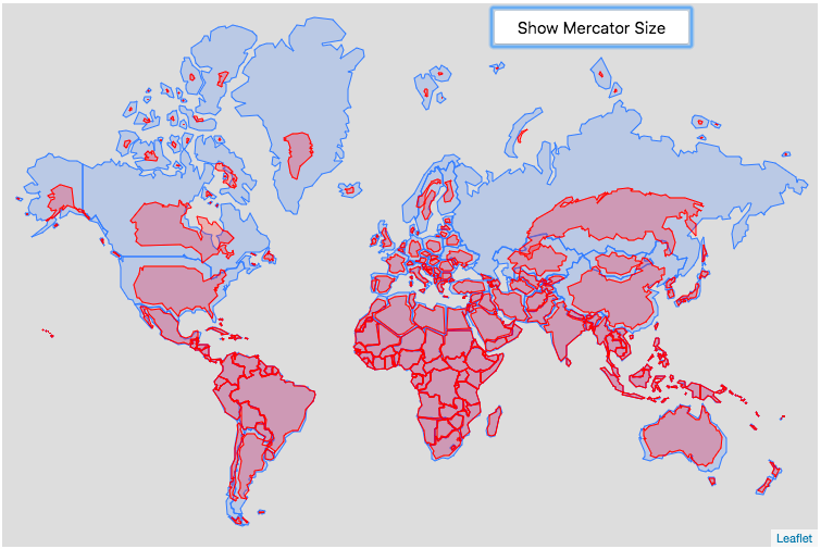
I've never really thought about Greenland being as big as it is until this issue was brought to my attention. In my mind it was something about the size of Ireland but covered in Ice. I see now, how wrong I was about the size, but still nothing I would give much thought to.

I have always marveled at the size, geography, eco-diversity and incredible resources of Africa. It has never occurred to me that anything else on the map came close.
 
A fun tool to see the 'real' sizes, relatively speaking.

(It explains how Great Britain can be 9th on the list of largest islands even when those Arctic ones seem so vast)

 
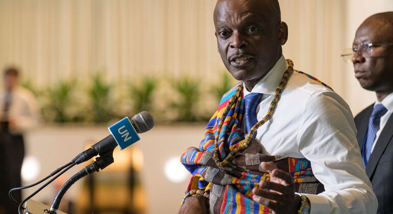
So the UN has officially endorsed the Equal Earth map projection, and calls on global organizations to adopt it over Mercator, which famously makes northern landmasses look way bigger than those closer to the Equator.

Personally I support the move. It's a symbolic gesture as of course the UN can't, nor of course should it, force anyone to use a given map projection, but it's part of a move away from Mercator to more fitting map projections, and I welcome that. Supporters will point out that Mercator is great for navigation, but it's still less great for hanging on classroom walls to teach kids what the continents look like. Let Equal Earth or something similar be the projection for classrooms, political maps, etc., then we can use Mercator when that's actually the best projection for the task.

I'd also like to add a nitpick, as someone who has a degree in geography (including cartography): I see the Equal Earth projection referred to as a 'correction' online. This isn't accurate --map projections have different purposes and are all a compromise that correctly shows something correctly --distance, direction, area, or shape.

UN article:
 
"Error" is, I would agree, an unnecessarily strong word to single out the Mercator projection with;  any map projection is inevitably erroneous. However, the entire objection to the Mercator projection is that its  choice of error is in the apparent relative areas of land masses at different latitudes, which exaggerates those further from the equator, in order to preserve the accuracy of directions. Greenland's apparent size is a classic example of the exact issue that is under discussion here.

If you think this is a discussion about the best projection to use for navigation, then I think you may be mistaking what century this is; other than for historical re-enactment, I would be surprised if anyone uses a flat Mercator projection map for serious navigation in the age of GPS. It is actually a discussion about more or less misleading visual aids for presentation of geographical and geopolitical data. As such, it's purely a political issue.

Dave
I don't think "error" is too strong a term. I think it is the wrong term altogether. Mercator didn't ◊◊◊◊ up. His projection is correct in every way. It even correctly represents the areas of the land masses, if you bother to read it and understand that the scale changes with latitude.

And yes, I understand that the issue is one of politics, not one of navigational practicality. The UN is the perfect venue for this kind of thing. Even down to it being a problem of the UN allocating resources and taking things seriously based on how the Mercator projection makes them feel at first glance, rather than based on what it actually is.
 
....if you bother to read it and understand that the scale changes with latitude.
Out of the eight or so billion people on earth, what percentage do you think look at a map and consider the scale, instead of thinking " OMG, Greenland is almost as big as Africa !" ?

An easier question might be, "How many do you think know what 'latitude' means?".
 
Last edited:
"Error" is, I would agree, an unnecessarily strong word to single out the Mercator projection with;  any map projection is inevitably erroneous. However, the entire objection to the Mercator projection is that its  choice of error is in the apparent relative areas of land masses at different latitudes, which exaggerates those further from the equator, in order to preserve the accuracy of directions. Greenland's apparent size is a classic example of the exact issue that is under discussion here.
As long as when you say 'choice of error' you don't literally mean that they consciously made a decision to make Europe look much bigger than Africa. Which I guess you didn't, but it bears pointing out. The error, as you say, comes from the choice of what to preserve, and the stretched landmasses up north is a byproduct of that. Maps are accurate at a single point or along a single line, called the standard line, so Mercator grows increasingly warped the farther you get from the Equator (Correct me if I'm wrong on any of this, of course --for all I know they could also have chosen the eqautor as the standard line precisely because it makes Europe looks bigger than Africa!).

All that doesn't also mean that white powers didn't also take to the map and make it their classroom map of choice for political reasons, of course ;).

If you think this is a discussion about the best projection to use for navigation, then I think you may be mistaking what century this is; other than for historical re-enactment, I would be surprised if anyone uses a flat Mercator projection map for serious navigation in the age of GPS.
Yes and no, I mean, GPS necessarily uses a flat map as a base, so they need to pick a map projection for that flat map. In fact in geography we extensively used the Universal Transverse Mercator (UTM) projection, which is also the projection used by police, rescuers, the military, and other agencies who need precise maps with very little deviation from the standard line because, well, instead of one map with one standard line...

1788636068909.png

...you have a series of maps (zones) next to each other, each with their one standard line running north-south down the middle.
 
It's not the size that looks strange, it's the shapes. There's more elongation along the north-south axis than we're accustomed to seeing. It's like a bunch of countries lost weight and grew taller!
That's what I don't really understand. Because a degree of latitude is a very similar distance regardless of latitude* (or longitude)

But a degree of longitude goes from over 100km at the equator to zero at the poles. So I'd think the low latitude countries should be the same height but fatter.

*Not identical, due to the poles being flattened.
 
I don't think "error" is too strong a term. I think it is the wrong term altogether. Mercator didn't ◊◊◊◊ up. His projection is correct in every way. It even correctly represents the areas of the land masses, if you bother to read it and understand that the scale changes with latitude.

And yes, I understand that the issue is one of politics, not one of navigational practicality. The UN is the perfect venue for this kind of thing. Even down to it being a problem of the UN allocating resources and taking things seriously based on how the Mercator projection makes them feel at first glance, rather than based on what it actually is.
And bearings work on the Mercator projection in a way that they don't for any other projection
 
So the UN has officially endorsed the Equal Earth map projection, and calls on global organizations to adopt it over Mercator, which famously makes northern landmasses look way bigger than those closer to the Equator.

Personally I support the move. It's a symbolic gesture as of course the UN can't, nor of course should it, force anyone to use a given map projection, but it's part of a move away from Mercator to more fitting map projections, and I welcome that. Supporters will point out that Mercator is great for navigation, but it's still less great for hanging on classroom walls to teach kids what the continents look like. Let Equal Earth or something similar be the projection for classrooms, political maps, etc., then we can use Mercator when that's actually the best projection for the task.

I'd also like to add a nitpick, as someone who has a degree in geography (including cartography): I see the Equal Earth projection referred to as a 'correction' online. This isn't accurate --map projections have different purposes and are all a compromise that correctly shows something correctly --distance, direction, area, or shape.

UN article:
Someone has pointed out that the map they showed has Crimea in Russia. 😡
 
Last edited:

ISF - Join now!

Every member here is approved by hand. No bots, no spam, just people who care about evidence and honest debate.

Membership is free!

Create your free account

Back
Top Bottom