Global warming discussion IV

Status
Not open for further replies.
In case anyone got taken in by Furcifer's BS, SkS have come up with a very good article about the impact of meat product on climate change:

http://www.skepticalscience.com/how-much-meat-contribute-to-gw.html#.Vl3pb3RbOPI.facebook

Sorry, I started playing with the little magnifying disc and forgot what I was gonna say! -Cool beans

Oh - here is the part that bothers me:

...An oft-used comparison is that globally, animal agriculture is responsible for a larger proportion of human-caused greenhouse gas emissions (14-18%) than transportation (13.5%). While this is true, transportation is just one of the many sources of human fossil fuel combustion...

two primary points

1) a significant part of the carbon footprint of Beef comes from the fuels used to grow/harvest and process the feed crops, transport them, and then transport the resulting beef from Australia and S. America to places across the face of the planet.

2) even the CH4 from cattle (and lambs) is carbon already in the planet's active carbon cycle, not new carbon being brought in from outside the system.

I've no problem with the concept that we should eat a lot less Beef than we do (primarily from a health perspective) but with regard to AGW, once fossil fuels are removed from the equation, beef (and lamb) is largely a non-issue.

(this all said, it is a very good article,...especially with respect to the little magnifying disc!:) )
 
Last edited:
In case anyone got taken in by Furcifer's BS, SkS have come up with a very good article about the impact of meat product on climate change:

http://www.skepticalscience.com/how-much-meat-contribute-to-gw.html#.Vl3pb3RbOPI.facebook


That's just a distraction for the AGW bandwagon trying hard to stop the wheels coming off in COP21 Paris 2015 ...

Developing Countries: We want a Trillion Dollars to Sign your Climate Agreement

Good read and some great comments :
"Paris CoP is their last chance to make a land grab while the going’s still good. They (the UN) managed to get both Canada and Australia on board at the last moment by engineering regime change in both countries (as Chris Monckton, a year ago, predicted would happen) and with Obama still in office for this CoP they figure it’s ‘now or never’ to go for broke and try and get that whole ‘world governance’ thing finally in the bag.

But in the end the fracture lines in the CAGW edifice will propagate into structural weakness and ultimately into collapse. May take some time yet, but skeptics have all the time we need. CAGW zealots, on the other hand, are fast running out – 30 years of no climate catastrophe and counting…"


If it's not Developing Countries putting a spoke in the wheels it's Gaia :eek:

One Volcano Exposes The Massive Carbon Scheme Fraud
Where Does the Carbon Really Come From?

Eyjafjallajokull volcano, since its first spewed volcanic ash, in just FOUR DAYS, NEGATED EVERY SINGLE EFFORT you have made in the past five years to control CO2 emissions on our planet - all of you. And now with Iceland's Grimsvotn volcano erupting on May 21, 2011, it has been a losing battle.

Of course you know about this evil carbon dioxide that we are trying to suppress - it's that vital chemical compound that every plant requires to live and grow and to synthesize into oxygen for us humans and all animal life.


And the bad news for the AGW crowd just doesn't stop ...

COP21: Public support for tough climate deal 'declines'
Most developed countries have seen a significant drop in support for strong climate leadership

All told an average of 42% of those polled want their government to play a leadership role in setting ambitious targets, while another 41% want their government to take a more moderate approach and support only gradual action.
"The public are less concerned about climate change, and when you put that in the context of the climate conference in Paris, the findings show less support for an ambitious and binding agreement at a global level than there was ahead of COP15 in 2009 in Copenhagen," said Lionel Bellier, from GlobeScan.
"It's not an abrupt change of views, the trend seems to be now towards a softer approach."


Oh dear! :cool:


3823656486e1a76889.png
 
3823656486e1a76889.png


I'm sure others have examined this graph before, but for new-comers, here's my take on it.
(As usual, if anyone has corrections, insights, additional input etc please feel free to chip in)

OK, first let's look at the large print...

"1/3 of Man's climate influence since 1750, but..."
"No global warming for 18 years 9 months"

This does seem to indicate that "18 years 9 months" is a third of the time since 1750, but, of course, one third of the time since 1750 is 88.3 years, not 18 years 9 months - the claim is out by 4.7 times!

This is a major fail! Either the graphs author is incompetent (Can't do basic maths), or disingenuously dishonest (Expecting readers to just take this error 'as is' without thinking).

Secondly, let's look at the small print, starting with the lower text...

"Trend = 0.00 C° (=0.00 C°/century)"
"r2 = 0.000"

This appears to indicate that the graph is showing Temperature against Time, but if we look at the small print at the top of the graph...

"RSS global mean temperature change: 225 months February 1997 to October 2015"

We see that it actually shows Change in Temperature against Time - This is different!

So, what is the graph actually showing? Not a 0.00°C change in temperature, but an average positive change in temperature of 0.25°C during the period shown, or +0.133°C per decade.

Assuming this rate continues, then we have a rise in temperature, from this year to 2100, of 1.133°C - add this to the 1°C increase already seen since pre-industrial times, and we have 2.133°C above pre-industrial times by the end of the century - above the maximum change needed to avoid really damaging stuff.

So, in conclusion, rather than showing that Global Warming has stopped, the graph actually shows the warming continuing apace - and on-target to exceed 2°C by the end of the century.
Surely not the message Haig was hoping to convey! :eek:
 
So, in conclusion, rather than showing that Global Warming has stopped, the graph actually shows the warming continuing apace - and on-target to exceed 2°C by the end of the century.
Surely not the message Haig was hoping to convey! :eek:


We've had this dance before :p

The Earth is on "simmer" ;) How many tenths of a degree is 2015 suppose to be warmer than 2014 ??? How do we measure tenths of a degree and is it statistically significant ? NO is the answer! :D

Just wait for the big drop :jaw-dropp
 
[qimg]http://www.internationalskeptics.com/forums/imagehosting/3823656486e1a76889.png[/qimg]

I'm sure others have examined this graph before, but for new-comers, here's my take on it.
(As usual, if anyone has corrections, insights, additional input etc please feel free to chip in)

OK, first let's look at the large print...

"1/3 of Man's climate influence since 1750, but..."
"No global warming for 18 years 9 months"

This does seem to indicate that "18 years 9 months" is a third of the time since 1750, but, of course, one third of the time since 1750 is 88.3 years, not 18 years 9 months - the claim is out by 4.7 times!

This is a major fail! Either the graphs author is incompetent (Can't do basic maths), or disingenuously dishonest (Expecting readers to just take this error 'as is' without thinking).

Secondly, let's look at the small print, starting with the lower text...

"Trend = 0.00 C° (=0.00 C°/century)"
"r2 = 0.000"

This appears to indicate that the graph is showing Temperature against Time, but if we look at the small print at the top of the graph...

"RSS global mean temperature change: 225 months February 1997 to October 2015"

We see that it actually shows Change in Temperature against Time - This is different!

So, what is the graph actually showing? Not a 0.00°C change in temperature, but an average positive change in temperature of 0.25°C during the period shown, or +0.133°C per decade.

Assuming this rate continues, then we have a rise in temperature, from this year to 2100, of 1.133°C - add this to the 1°C increase already seen since pre-industrial times, and we have 2.133°C above pre-industrial times by the end of the century - above the maximum change needed to avoid really damaging stuff.

So, in conclusion, rather than showing that Global Warming has stopped, the graph actually shows the warming continuing apace - and on-target to exceed 2°C by the end of the century.
Surely not the message Haig was hoping to convey! :eek:


Thank you for the detailed breakdown. Every time Haig posts that exact same graph, someone lets him (and the lurkers) know that the graph actually shows exactly what you say. A ~0.25°C warming trend. It is literally right there in the graph. We know Haig doesn't have all of us on ignore as he responds to our posts when we point out his interpretation is clearly wrong, but his replies are basically just "Nuh uh" followed by another post usually with a link to the WWUT website/blog.

I'm not sure if it is better to just ignore him or keep repeating why he is wrong over and over for the occasional new lurker that comes by here (and makes it through the thousand posts in this thread).
 
Only if you believe Co2 is a poison and not a plant food and that it LAGS temperature NOT DRIVES it !

Haig ....you have been told dozens of times that C02 is BOTH a feedback and a forcing - it has nothing to do with belief and everything to do with evidence....something you consistently do NOT get.

Stop parading your ignorance in a science thread.

CO2 as a Feedback and Forcing in the Climate System Common Climate Misconceptions
Thursday, October 25, 2007
TOPICS
ScienceBy Zeke Hausfather

A fundamental misconception about the role that carbon dioxide plays in glacial transitions has helped fuel the argument that the lag time between temperature and CO2 in the paleoclimate record casts doubt on carbon dioxide as an important greenhouse gas.

It’s crucial that media reporting on climate change understand an important distinction between the dual roles of greenhouse gases as both forcings and feedbacks.

more
http://www.yaleclimateconnections.o...a-feedback-and-forcing-in-the-climate-system/
 
Last edited:
CO2 can be either a plant food or a poison or both. A rise in its atmospheric concentration can either lag temperature rise or drive it or both. But there's no point in explaining any of that to Haig because he will simply ignore it like he always does.
 
We've had this dance before :p

The Earth is on "simmer" ;) How many tenths of a degree is 2015 suppose to be warmer than 2014 ??? How do we measure tenths of a degree and is it statistically significant ? NO is the answer! :D

Just wait for the big drop :jaw-dropp

Ha Ha Ha Ha.... This graph you keep showing doesn't say 'simmer', it says "No Global Warming"!!

You can't even keep your OWN story straight, can you! :D:D:D

Oh, and "Just wait for the drop"? - Are you kidding? We've all been waiting for this DROP for, how long? 10 years, 15 years, 20 years?

It's like waiting for the Second Coming - Just wait, any day now...
 
[qimg]http://www.internationalskeptics.com/forums/imagehosting/3823656486e1a76889.png[/qimg]

I'm sure others have examined this graph before, but for new-comers, here's my take on it.
(As usual, if anyone has corrections, insights, additional input etc please feel free to chip in)

OK, first let's look at the large print...

"1/3 of Man's climate influence since 1750, but..."
"No global warming for 18 years 9 months"

This does seem to indicate that "18 years 9 months" is a third of the time since 1750, but, of course, one third of the time since 1750 is 88.3 years, not 18 years 9 months - the claim is out by 4.7 times!

This is a major fail! Either the graphs author is incompetent (Can't do basic maths), or disingenuously dishonest (Expecting readers to just take this error 'as is' without thinking).

Secondly, let's look at the small print, starting with the lower text...

"Trend = 0.00 C° (=0.00 C°/century)"
"r2 = 0.000"

This appears to indicate that the graph is showing Temperature against Time, but if we look at the small print at the top of the graph...

"RSS global mean temperature change: 225 months February 1997 to October 2015"

We see that it actually shows Change in Temperature against Time - This is different!

So, what is the graph actually showing? Not a 0.00°C change in temperature, but an average positive change in temperature of 0.25°C during the period shown, or +0.133°C per decade.

Assuming this rate continues, then we have a rise in temperature, from this year to 2100, of 1.133°C - add this to the 1°C increase already seen since pre-industrial times, and we have 2.133°C above pre-industrial times by the end of the century - above the maximum change needed to avoid really damaging stuff.

So, in conclusion, rather than showing that Global Warming has stopped, the graph actually shows the warming continuing apace - and on-target to exceed 2°C by the end of the century.
Surely not the message Haig was hoping to convey! :eek:

This is quite embarrasing but how do you actully see the 0.25°C change or the +0.1333 per decade in the graph?
 
How many tenths of a degree is 2015 suppose to be warmer than 2014 ??? How do we measure tenths of a degree and is it statistically significant ?

If that’s your level of understanding of statistics you should give up now. Random sample to sample variation doesn’t limit your ability to identify trends over sufficiently large sample sizes. Pretty much everything in the modern world wouldn’t work if this were not the case.
 
This is quite embarrasing but how do you actully see the 0.25°C change or the +0.1333 per decade in the graph?

Assuming the actual data shown in the graph is correct, it shows an average change in temperature over the 18 years 9 months of~0.25C (look at the Y-axis).

Now, 0.25C in 18.75 years is 0.1333C in 10 years (0.25/18.75 = 0.01333C per year. Times 10 = 0.1333C per decade).

There are 8.5 decades left before 2100, so 0.1333 x 8.5 = 1.1333C
Add the 1C rise we have already seen, gives us a 2.1333C increase in global temperatures above pre-industrial times by the end of the century.
 
Secondly, let's look at the small print, starting with the lower text...

"Trend = 0.00 C° (=0.00 C°/century)"
"r2 = 0.000"

This appears to indicate that the graph is showing Temperature against Time, but if we look at the small print at the top of the graph...

"RSS global mean temperature change: 225 months February 1997 to October 2015"

We see that it actually shows Change in Temperature against Time - This is different!

This is probably a labelling error; the data mostly matches the RSS lower troposphere temperature data. It just has a cherry picked data set and start point so the “trend” line starts 0.25 degrees above where the long term trend is. IOW it assumes there was an instantaneous warming of 0.25 deg C in 1998 and temperatures haven’t changed since.

Also since its RSS it’s not surface temperature it’s lower troposphere data, and there may be something going on with the RSS dataset itself. The trend in the RSS data is the lowest of all the data sets, and satellite data is notoriously finicky, the calculations involved in arriving at temperature are very complex and can be thrown off by small changes in orbits and sensors. Surface station data is much more reliable, and actually measures surface temperatures, which is what we are normally interested in.
 
Assuming the actual data shown in the graph is correct, it shows an average change in temperature over the 18 years 9 months of~0.25C (look at the Y-axis).

Now, 0.25C in 18.75 years is 0.1333C in 10 years (0.25/18.75 = 0.01333C per year. Times 10 = 0.1333C per decade).

There are 8.5 decades left before 2100, so 0.1333 x 8.5 = 1.1333C
Add the 1C rise we have already seen, gives us a 2.1333C increase in global temperatures above pre-industrial times by the end of the century.

Thanks thats what I guessed ;)
 
There are 8.5 decades left before 2100, so 0.1333 x 8.5 = 1.1333C

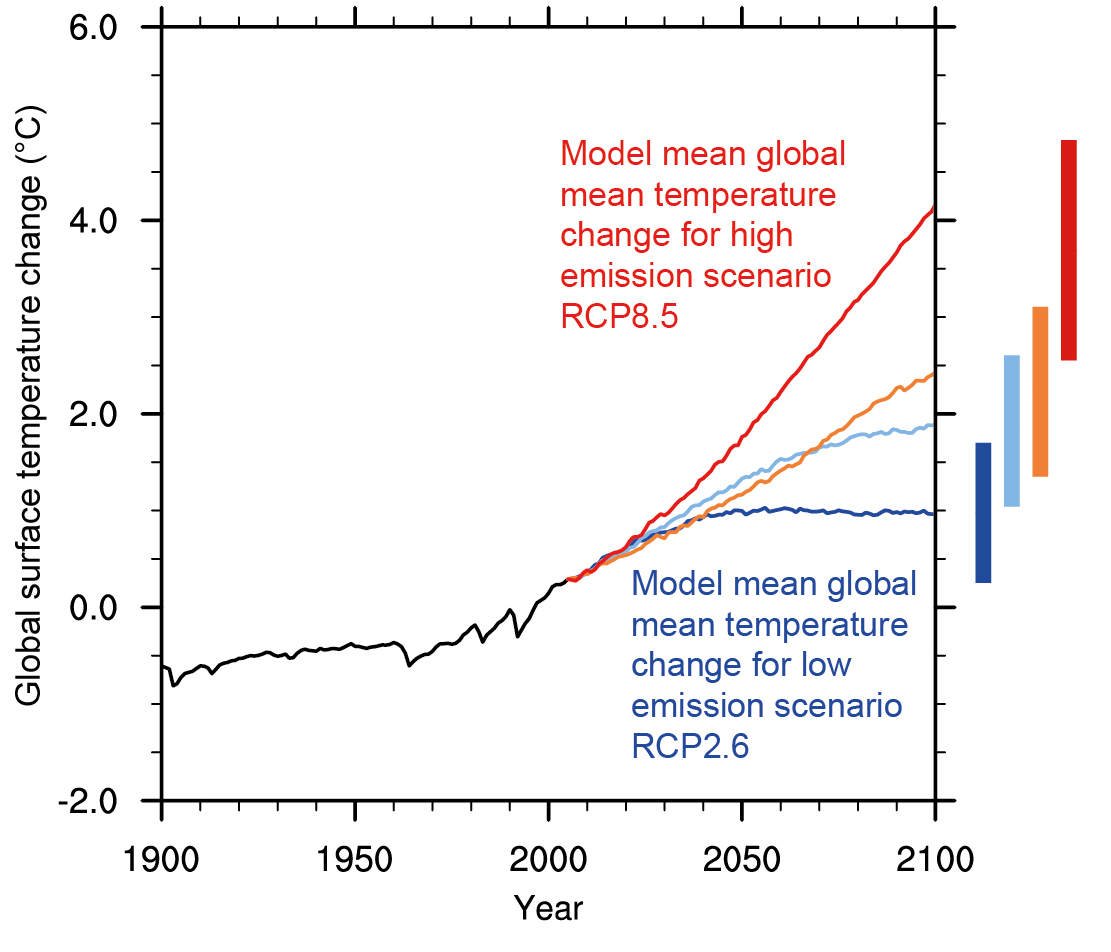
that might be simplistic...not certain that it would be anything like linear. BAU projections generally are sitting in the 3c + range

ScenarioTempGraph.jpg


Observed and projected changes in global average temperature under four emissions pathways. The vertical bars at right show likely ranges in temperature by the end of the century, while the lines show projections averaged across a range of climate models. Changes are relative to the 1986-2005 average. Source: IPCC, 2013, FAQ 12.1, Figure 1.

I'm pretty certain we won't stay under 2 C

http://www3.epa.gov/climatechange/science/future.html
 
Last edited:
"There's no such thing as global warming."

"There is? Oh, well it's not our fault."

"It is? Well, we can't do anything about it anyway."

"We can? Well it could cost too much."


That last argument is actually the first one. The whole reason for the AGW denial: it's inconvenient.
 
that might be simplistic...not certain that it would be anything like linear. BAU projections generally are sitting in the 3c + range

<snip image>


I'm pretty certain we won't stay under 2 C

http://www3.epa.gov/climatechange/science/future.html

Oh you are quite right - extrapolating from a single source, dubiously mangled, is extremely simplistic :)
I'm pretty sure, even if the Paris talks are successful, that temps are going to rise much more than 2C.

The scary thing is that people tend to look to the end of the century, not realising that damaging changes are going to occur (Actually occurring now!) as the years pass.

There won't be 'quiet..quiet..quiet..BANG!'

It will more likely be 'Bad..Badder..Worse..even Worser..OW!..Oh why didn't we Listen!!' :jaw-dropp

Not "Alarmist" just alarming :(
 
Status
Not open for further replies.

Back
Top Bottom