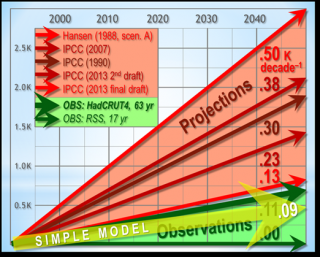
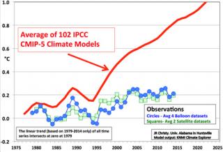
The graph shows the latest computer model simulations (from the CMIP project), which were used as input to the IPCC, along with five different temperature datasets. The comparison to be made is of the heavy dashed line (annotated in the graph just below the solid black line) and the colored lines. The heavy dashed line is the average predicted temperature including updated influences from a decrease in solar energy, human emitted heat-reflecting particles, and volcanic effects.
The dashed line is slightly above the colored markers in recent years, but the results are quite close. Furthermore, this year’s temperature to date is running hotter than 2014. To date, 2015 is almost exactly at the predicted mean value from the models. Importantly, the measured temperatures are well within the spread of the model predictions.
")

 !
! !
!